11 newsletter design trends for creative emails

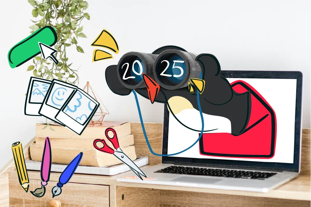
First impressions count, including in email marketing! By aligning your emails with the latest newsletter design trends, you can make sure your newsletter immediately stands out, wins readers over and leaves them wanting more. Looking for newsletter design inspiration? You have come to the right place! We asked Michael, our Senior Designer at rapidmail, which newsletter design trends he sees emerging in 2025 and have put together our top 11 for you. ☀️
Create designs and try rapidmail for free
1. Trend: Creative typography, when type becomes a brand signature
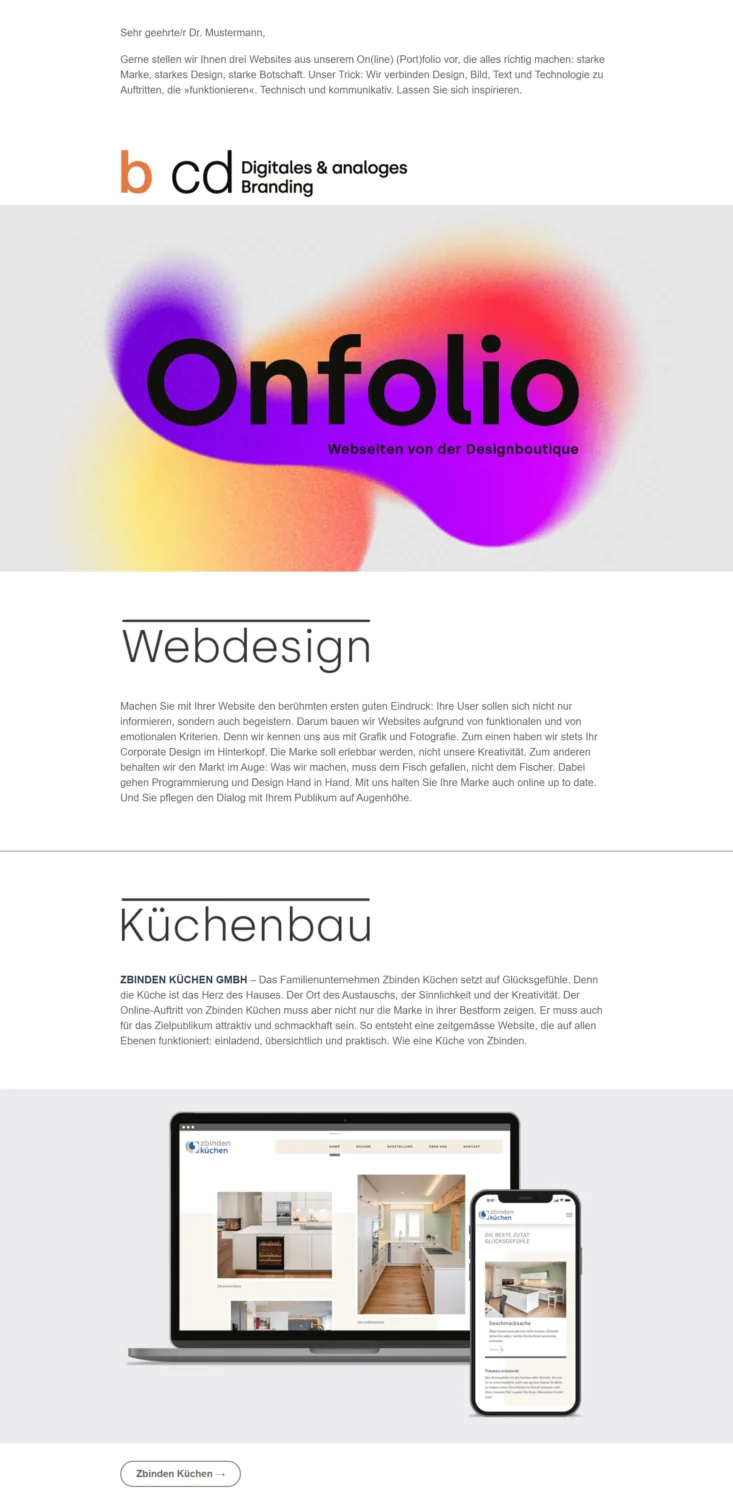
Newsletter design is getting exciting in 2025, thanks to creative typography! Leading the way are bold typefaces and distinctive web fonts that not only grab attention but also give your brand identity a real boost. A bold, striking headline here, a playful typeface there: it is the icing on your newsletter that makes all the difference. 🍰
Why? It is simple: the right typography lets you visually reinforce your brand voice and make your brand more recognizable. Bold fonts create genuine “aha” moments in headlines and give your design an unmistakable identity. Best of all, web fonts that display flawlessly on every device keep your corporate design completely consistent in email marketing, whether viewed on a phone or desktop.
So why not use distinctive typefaces as your new brand signature? You will not only take your newsletter design to the next level, but also turn your corporate design into a real eye-catcher. And who would not want their newsletter to attract a little more attention in the inbox? 🙌
Example from bcd Designstudio: Eye-catching typography
💡 rapidtip: Create personalized newsletter designs with just one click
The rapidmail 1-click design makes creating a custom newsletter template in your corporate design effortless! Simply enter your website URL and click the “Continue” button. 1-click design then creates modern newsletter templates that fit seamlessly into your company communications and make your brand more recognizable.
Using the color palette is just as easy: click the background, email canvas or text area, for example, and adjust the colors as you wish. You can edit your color palette on the left and even add more colors if you need another shade 🖌️
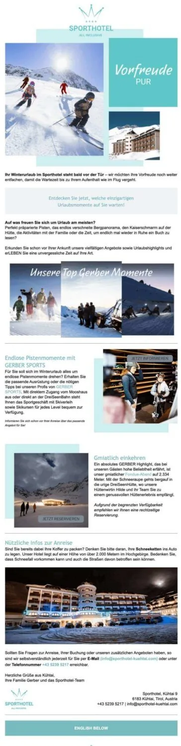
Example from Sporthotel Kühtai: Fonts and colors in the corporate design
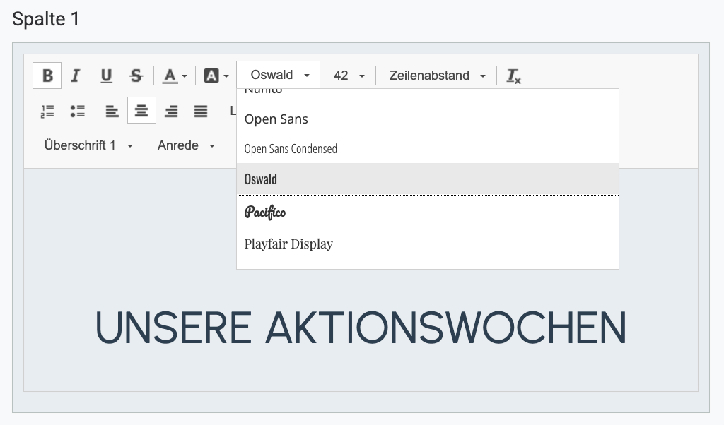
💡 rapidtip
Whether your style is creative, elegant or serious, 40 fantastic web fonts are waiting for you in the rapidmail email editor, giving your emails that special touch and making them even more impressive and effective.
2. Trend: Make an impact with 2025’s trending colors and bold color choices
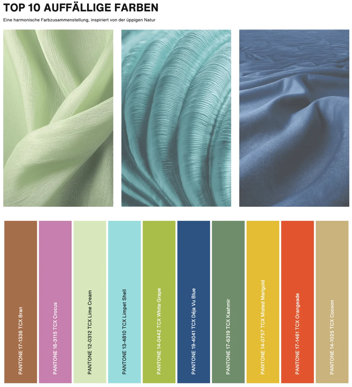
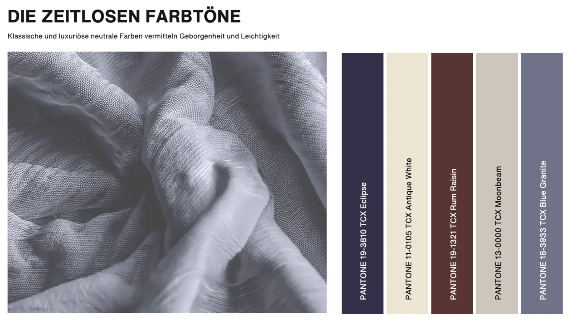
If you would like to refresh your newsletter layout, take a look at the latest trending colors for 2025. While the Pantone Color Institute has named “Mocha Mousse”, a warm, rich shade of brown, as its color of the year for 2025, the fashion color trend report predicts the following trending colors for the spring/summer 2025 season in the New York fashion world. Which do you like best?
💡 rapidtip
When designing your newsletter layout, always keep your target audience and the goal of the email in mind to ensure consistent customer communication. Depending on your industry and company, a more understated newsletter design without many graphic elements may be appropriate. If your newsletter copy takes a factual tone because it covers a serious subject, for example, the design should also be restrained and neutral. In marketing and for creative topics, however, your newsletter can be more colorful, so feel free to unleash your creativity!
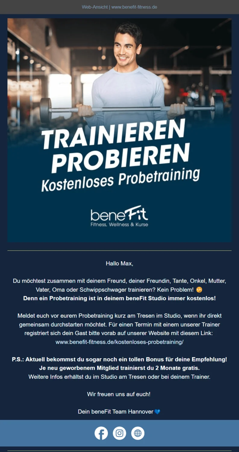
Duotone design trend: Two colors, one clear message
The duotone trend uses just two colors in an email marketing design: one for the text and one for the background. The result is a harmonious, uncluttered design that feels modern and accessible. By also ensuring good color contrast, you fulfill an important requirement for accessible newsletters.
Multicolor gradient design trend: Retro style with flair
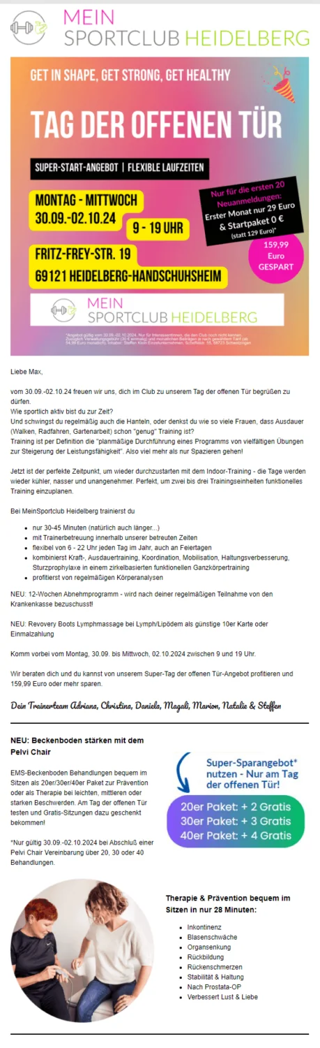
Another color trend becoming increasingly popular in email marketing is multicolored gradients. Their smooth transitions give newsletters a striking retro look that immediately attracts attention. Gradients help you stand out from the crowd while adding a nostalgic accent, perfect for newsletter designs with character!
Example of an email newsletter design with a gradient from MeinSportclub Heidelberg
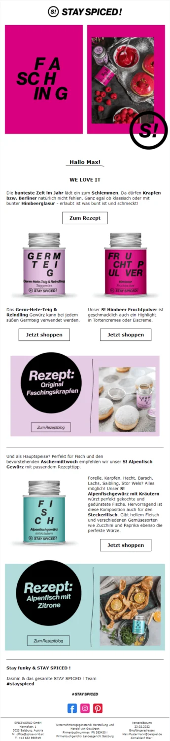
3. Trend: Minimalism meets asymmetry, modern newsletter layouts that inspire
Why stick to straight lines and perfectly balanced structures? Asymmetrical layouts breathe fresh life into your newsletter design and immediately attract attention. Deliberately uneven arrangements of text, images or graphics create an exciting look that inspires your readers and piques their curiosity.
Combined with minimalist elements such as clear structures and generous white space, asymmetrical design reveals its full potential. The targeted use of open space directs attention to the essential content, while the unconventional layout creates dynamism and individuality. The result is a modern email newsletter design that is both attractive and functional.
Beautiful design example from STAY SPICED !: First-class minimalist asymmetry
💡 rapidtip
Put yourself in your subscribers’ shoes and sign up for a variety of newsletters yourself, such as those from online shops you use or blogs you enjoy reading. This lets you experience newsletters as a recipient and quickly see which designs appeal to you and which do not.
The rapidmail newsletter
Tips, ideas and news about email marketing, straight to your inbox.
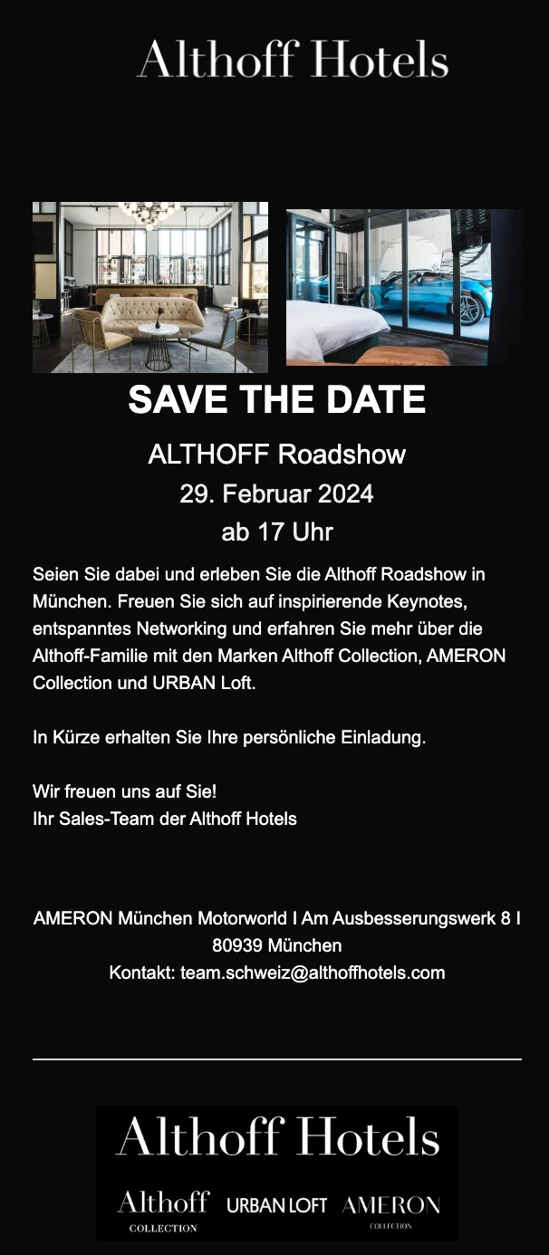
4. Trend: Stand out from the crowd with Dark Mode
We are carrying this trend straight over from 2024: a dark newsletter design, also known as Dark Mode, not only provides an appealing visual change, but also offers several practical benefits.
By using dark backgrounds and lighter text, Dark Mode reduces eye strain, something that today’s computer and smartphone users especially appreciate. Dark Mode also provides better readability and a pleasant reading experience for your subscribers.
What is more, using Dark Mode helps you stand out from the crowd and makes your emails more memorable. Amid the daily flood of emails, a newsletter with a dark design clearly stands out because of its originality. The eye-catching presentation grabs your contacts’ attention and increases the likelihood that your message will stick in their minds.
Example of a dark newsletter design from Althoff Hotels
👀 Have you seen this? Email marketing trends for 2025
Our Content Manager Wiebke does not just keep track of every design trend, she also knows exactly which general trends you should follow for successful email marketing in 2025. Roll the film! 🎬
Open video transcript
Chapter 1: Introduction
It is now 2025 and email is still not dead, even though skeptics have been predicting its demise for years. In fact, the opposite is true: email marketing remains one of the most profitable communication channels. To make 2025 your year, I will show you the seven most important trends, from accessibility, automation and artificial intelligence to the most beautiful email design trends. Let’s get started!
Chapter 2: Email marketing trend 1: Accessibility
On June 28, 2025, the German Accessibility Strengthening Act (Barrierefreiheitsstärkungsgesetz, BFSG) comes into force, transposing the European Accessibility Act into national law. The aim of the law is to design digital products so that people with disabilities or limited experience of digital media can find, access and use them without outside help. This is intended to make the digital world more inclusive and accessible to everyone.
Although newsletters are not explicitly mentioned in the law, it is a great opportunity for companies to make their communications accessible, stand out from the competition and make it easier for the people concerned to engage with them. To ensure your newsletter is easy for all recipients to read, you should design it accordingly. Clear copy with plenty of white space and clearly identifiable buttons and links make reading easier. High-contrast colors help people with impaired vision or color blindness. People who cannot see or read use screen readers to have content read aloud. To make this work effectively, you should add alt text to every image and graphic that describes its content in words. And do not worry: these tips do not only make newsletters easier for people with disabilities to read, but also improve newsletter design overall.
Chapter 3: Email marketing trend 2: Automation
Emails sent to the right person at exactly the right time are especially effective. Email automation keeps this process efficient because emails are created once and then sent automatically to specific target groups. This means you always reach your contacts at the perfect moment, whether with welcome emails, appointment reminders or birthday greetings.
An email automation tool lets you create individual email sequences that deliver precisely the content your contacts need at that moment. This not only increases your revenue, but also helps you win new customers and build trust in your company.
Good news: rapidmail recently launched new email automation functionality that makes creating automations even easier with practical workflow templates, even if you have no previous experience. If you would like to try rapidmail, use the link in the video description to receive 50% off your first invoice.
Chapter 4: Email marketing trend 3: Artificial intelligence
Artificial intelligence can take a great deal of work off your hands in email marketing. Back in 2024, I presented the best tips on the subject in a video, and every one of them is still completely relevant in 2025! AI can save you a lot of time, for example when writing newsletter copy. Of course, you should still review it before sending and adapt it to your company’s tone of voice.
Alongside the AI send-time planner, which creates a tailored sending schedule for your company, rapidmail now also provides AI-generated suggestions for newsletter subject lines. Simply enter a keyword or idea and the AI writes appealing subject lines that meet all the key criteria: they are short and punchy and include suitable emojis. You will never again have to spend ages thinking about how to write a subject line that stands out in your contacts’ inboxes!
Chapter 5: Email marketing trend 4: Personalization
Although AI makes email marketing easier, personal communication should still be a focus in 2025. Use AI as a tool, but your readers should not be able to tell that a machine is behind your emails.
Now that AI is present in so many areas, users value authentic, human interaction more than ever. You should therefore use more than technical personalization options such as personalized salutations: make all your communications as individual and engaging as possible. Write with passion and humor, share personal stories or anecdotes from your team and include photos in your signature to show who is behind your emails. This makes you memorable, builds trust and helps you stand apart from competitors.
Chapter 6: Email marketing trend 5: Engaging user experiences
In 2025, email marketing is all about tailoring content to your target audience, evoking emotions and making reading newsletters an experience. Think about creative ways to present your content.
Give your contacts good reasons to open your newsletter and look forward to every new issue. Gamification and interactivity are particularly popular in 2025. Use playful elements such as entertaining surveys that are not only fun, but also get people talking about your product. Animated GIFs can also bring movement to your newsletter and make it more interesting.
Chapter 7: Email design trend 1: Minimalism
Minimalism is one of the most important email design trends of 2025. As we mentioned in relation to accessibility, a clearly structured design with generous white space improves readability. At the same time, the minimalist look creates a tidy, clean newsletter that is particularly easy to produce.
Chapter 8: Email design trend 2: Creative fonts and large images
Simple designs can still include visual accents, such as creative fonts and large images that turn the header of your emails into a real eye-catcher. Choose a striking typeface that suits your corporate design, but remain consistent rather than using a different font every time. Large, attractive images instantly capture your readers’ attention and show at a glance what the newsletter is about.
This email design trend is particularly easy to implement with our free newsletter templates. Take a look at the links in the video description.
You can also find more email design trends for 2025 on our blog! The link to the article is in the information box too.
Chapter 9: Conclusion: Email marketing trends, must-have or nice-to-have?
Trends come and go. Just as in fashion, everyone can decide for themselves which developments to incorporate into their own style. Nevertheless, email marketing trends that improve the user experience for your contacts are particularly worth following. Accessibility, personalization and a clean design are genuine email must-haves in 2025!
And if you want to make your own life easier, you should definitely explore email automation and AI. Now I would love to hear your opinion: which email marketing trend do you want to try this year? Let us know in the comments!
Thank you for watching and see you soon!
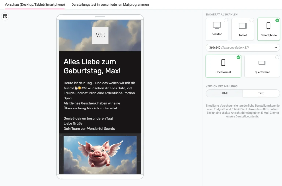
5. Trend: Mobile first and single-column design, scroll instead of search
2025 is all about mobile first, and your newsletter should be too. What does that mean for your newsletter? It is time to leave complicated layouts behind: single-column design is the answer! No displaced elements, no frantic zooming, just a simple, clear, readable design that is perfect for thumb scrolling. Let’s be honest: no one wants to fight through an email jungle just to find the most important information.
Best of all, rapidmail lets you test how your newsletter looks on different devices, whether desktop, tablet or smartphone. This makes sure your design not only looks good, but works brilliantly everywhere too! 📱 💻 ✅
👀 Did you know?
Did you know that the rapidmail image library gives you access to over 1.5 million royalty-free images to enhance your newsletter design? You can also easily edit your images in the rapidmail image editor. Crop, rotate and mirror images directly in your email and make them the same size across several columns with ease, all without any additional editing tools. You can also use stylish filters and add pre-designed text to the images. Designing visually appealing newsletters really is not complicated!
6. Trend: Emojis in newsletter design, small symbols with a big impact
Emojis are no longer reserved for chats and social media. In 2025, they are also playing an increasingly important role in newsletter design. The right symbols can liven up subject lines, visually structure content and convey emotions. After all, a 😍 or 🎁 often says more than a thousand words!
But be careful: less is sometimes more! Too many emojis can quickly look chaotic or unprofessional. Use them selectively to make your brand feel fresher, more modern and more approachable. Best of all, many email clients now display emojis consistently, so your contacts will not encounter any nasty surprises in their inboxes.
💡 rapidtip: Structure your newsletter
Apart from your email on “The-Chaos-Never-Ends Day”, the structure of your newsletter should always be clear and broadly follow the familiar structure of a newsletter with all the relevant components.
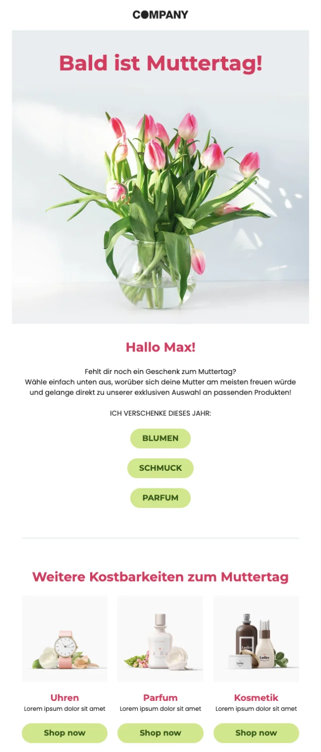
7. Trend: Interactive newsletters, take part instead of just reading
In 2025, newsletters should not only look good, but also invite readers to participate from time to time. Surveys, polls and small quiz elements increase engagement and make your emails more lively. After all, people who click are more likely to stay engaged! A survey is easy to implement with buttons containing links, for example. Your contacts simply click one of the answer buttons to vote, and the newsletter click map then shows you how many times each answer was clicked.
Interactive elements such as surveys or contests are not just fun for readers, they also give you valuable insights. So why not make your next email a little more exciting and turn your subscribers into active participants? ✅
Newsletter design example with an interactive survey
💡 rapidtip for your call-to-action buttons
A well-planned newsletter design with a cleverly positioned, eye-catching call-to-action button helps your subscribers understand which parts of the newsletter are clickable. In email marketing, this is known as conversion-centered newsletter design (or “conversion-centered newsletter design”). This means you should always keep in mind what you want your newsletter to achieve and how best to meet that goal while you are designing your emails.
Follow these tips to encourage as many subscribers as possible to click your CTA button:
- 🔝 Call to action “above the fold”: The CTA should appear near the top of the newsletter so that readers do not have to scroll for ages to find the button.
- 🎯 Use only one primary CTA where possible: Too many calls to action confuse subscribers because it is often no longer clear which button leads to which content. You can include additional CTAs, but they should look different from the most important call to action.
- 🎨 CTA color design: Use strong color contrasts so that the clickable button is clearly visible and stands out from the rest of the newsletter content.
- 🔥 Short, punchy label: To get readers to click, the CTA copy should have more energy than “More information” or “Click here”.
8. Trend: Striking email marketing design with mixed dimensions, creativity meets contrast
2025 is all about striking newsletter designs that do not just attract the eye, but also impress with mixed dimensions.
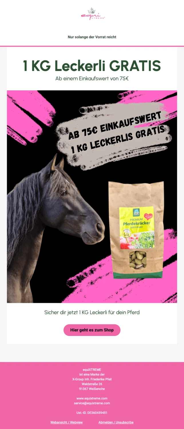
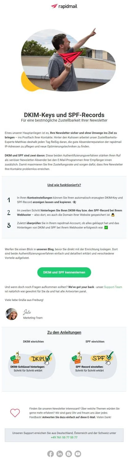
An exciting example is the combination of photography and illustration. Reality and imagination meet to create an incredibly powerful visual effect. This blend not only creates strong contrast, but also leaves room for creativity and new perspectives. For example, you can use breathtaking photos or modern graphics as a header image to make an impression.
Striking email marketing design is about setting deliberate accents that capture attention without overwhelming readers. The perfect balance of creative interplay between dimensions and a clear structure is key. It turns every email into a visual experience.
Example from equiXTREME: Modern newsletter design with the perfect mix of dimensions
Alternatively, immerse your illustrations directly in the photograph, for instance by placing a paper airplane in a colleague’s hand, as we did here with our deliverability expert Matthias. Your newsletter will instantly look even more professional and creative.
For more inspiration, feel free to browse our blog posts. We love using this mixed-dimensions trend in our header graphics. 💘
💡 rapidtip: Ensure a responsive display
When designing your newsletter layout, always keep your target audience and the goal of the email in mind to ensure consistent customer communication. Depending on your industry and company, a more understated newsletter design without many graphic elements may be appropriate. If your newsletter copy takes a factual tone because it covers a serious subject, for example, the design should also be restrained and neutral. In marketing and for creative topics, however, your newsletter can be more colorful, so feel free to unleash your creativity!
9. Trend: AI-assisted designs for email newsletters
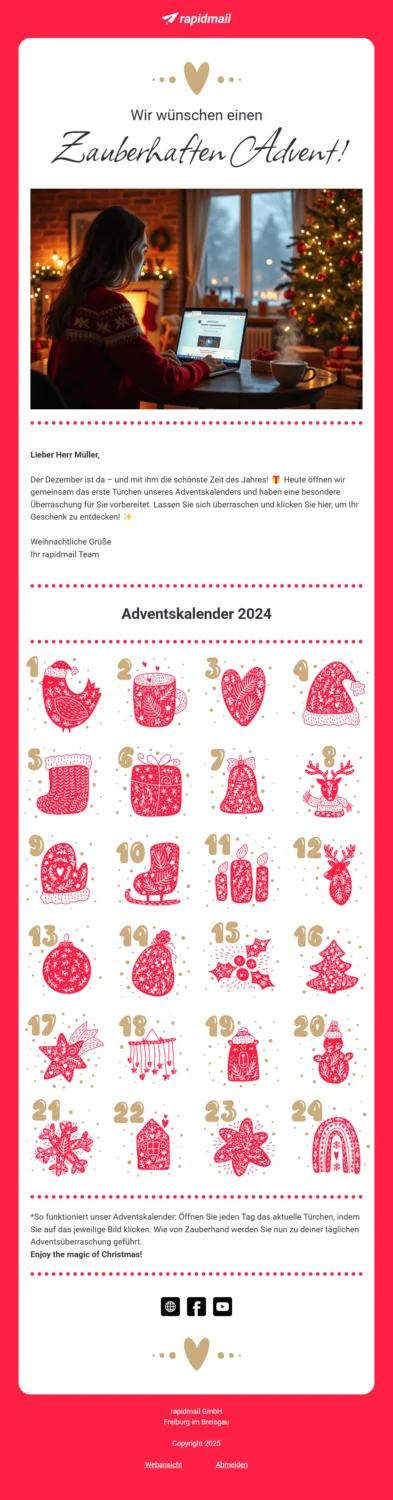
The use of AI (artificial intelligence) in email marketing is becoming ever more prevalent in 2025. A particularly noticeable trend is the integration of AI-generated images and writing aids from external tools, using them as inspiration for appealing newsletter designs. These innovations make it possible to design newsletters creatively while saving time.
Despite these technological advances, it remains crucial for your emails to be authentic and tailored to your target audience. Use AI suggestions as a valuable starting point, but leave room for your own creative signature and add the personal finishing touches that align them perfectly with your brand identity.
rapidmail’s AI features, such as the AI send-time planner and the AI subject-line generator, which automatically creates newsletter subject lines to suit your business, make it easy to optimize your email campaigns and content. AI also plays a central role in the latest email marketing trends, so it is high time to explore the subject in more detail. 👀
Example of a newsletter with an AI-generated image
💡 rapidtip
When designing your newsletter layout, always keep your target audience and the goal of the email in mind to ensure consistent customer communication. Depending on your industry and company, a more understated newsletter design without many graphic elements may be appropriate. If your newsletter copy takes a factual tone because it covers a serious subject, for example, the design should also be restrained and neutral. In marketing and for creative topics, however, your newsletter can be more colorful, so feel free to unleash your creativity!
10. Trend: Highlight sustainability with nature-inspired email design
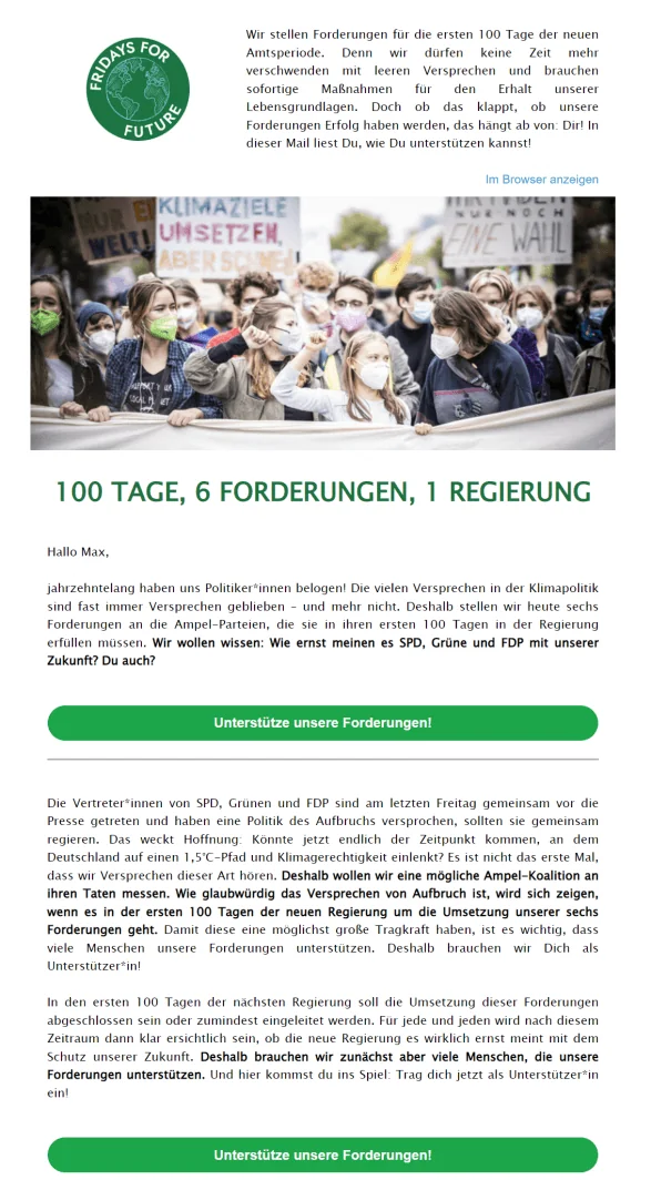
Are your company colors shades of green or brown? Jackpot! A newsletter design using green and brown tones can effectively draw attention to sustainability. It is even more authentic if these are also your company colors.
Green symbolizes nature and the environment, while brown tones evoke earth and sustainability. Earthy shades are also right on trend, as you already saw in trend no. 6, where we introduced the trending colors for 2025. Incorporating these colors into your newsletter design creates a visual connection with environmental awareness. You can also draw design inspiration for your newsletter from nature and use motifs such as trees, the sun and animals. 🌳🌞🐛
A newsletter example from Fridays For Future for email marketing design inspiration
💡 rapidtip: Do not engage in greenwashing
Important: for your “sustainable design” to be truly authentic, your company should actively protect the environment, or at least avoid harming it. Greenwashing is the practice of companies falsely presenting themselves as environmentally friendly without actually taking any ecological action. Your newsletter design should therefore be accompanied by specific information about sustainable activities so that you and your message remain credible.
If you cannot make large-scale sustainability efforts, small actions that you can share with your customers and tell them about are enough too. How about a little contest among colleagues, for example: who can leave the car at home most often over the course of a month and cycle or take the train to work instead? A mix of “green” design, content and challenges can make a big positive difference! 💚
11. Trend: Create a wow factor with animated GIFs
A real eye-catcher in 2025 email marketing design is animated GIFs, which add subtle but fascinating movement and immediately catch readers’ eyes when they open the email. Unlike conventional animations that are perceived as videos, cinemagraphs, or GIFs with just one repeating movement, resemble a still image with a livelier, almost magical touch. They create the impression that you have embedded a video in which only one area moves, perfect for sparking interest!
Whether used to showcase products or simply as an eye-catching accent, GIFs are the ideal way to give your newsletters a visual boost and create a powerful effect. Tools such as rapidmail make it easy to add these animations to your design and put the visuals center stage without becoming intrusive. A GIF can work equally well as a fake player image and entice recipients to visit your website with a single click, all without the challenge of embedding a video directly!
Newsletter example with an animated GIF
12. Conclusion: What makes a good newsletter design in 2025
To sum up, we have gathered all the key points that will turn your newsletter design into a feast for the eyes:
- ✅ The newsletter contains high-quality images, graphics or GIFs that suit the subject. The header graphic in particular should draw every eye and spark readers’ interest in the newsletter content. Aim for a balanced image-to-text ratio: ⅓ images and ⅔ text has become the rule of thumb.
- ✅ The newsletter has a highly recognizable look because it is tailored to the company’s corporate design.
- ✅ Highlights, text boxes, buttons and icons make the newsletter clear, harmonious and well structured.
👀 Did you know?
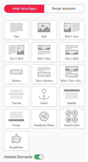
The rapidmail newsletter editor gives you all the layout elements you need: simply drag and drop them into the desired position in your newsletter, then add your own text, images and links. 🖌️
Whether viewed on desktop or smartphone, your newsletters are displayed on every device with a stunning design and clear structure!
- ✅ Generous white space gives readers’ eyes a brief rest and highlights the newsletter’s most important element, the call-to-action button. The “empty” space automatically guides your subscribers’ gaze toward the CTA, increasing the likelihood of a click.
- ✅ The CTA button is also clearly visible near the top of the newsletter and its eye-catching color makes it stand out immediately.
- ✅ The newsletter design is responsive and displays correctly on different screen sizes.
- ✅ Emojis, on-trend color concepts, different or overlapping fonts, wavy lines, mixed dimensions and other design trends can also give your email that special something.
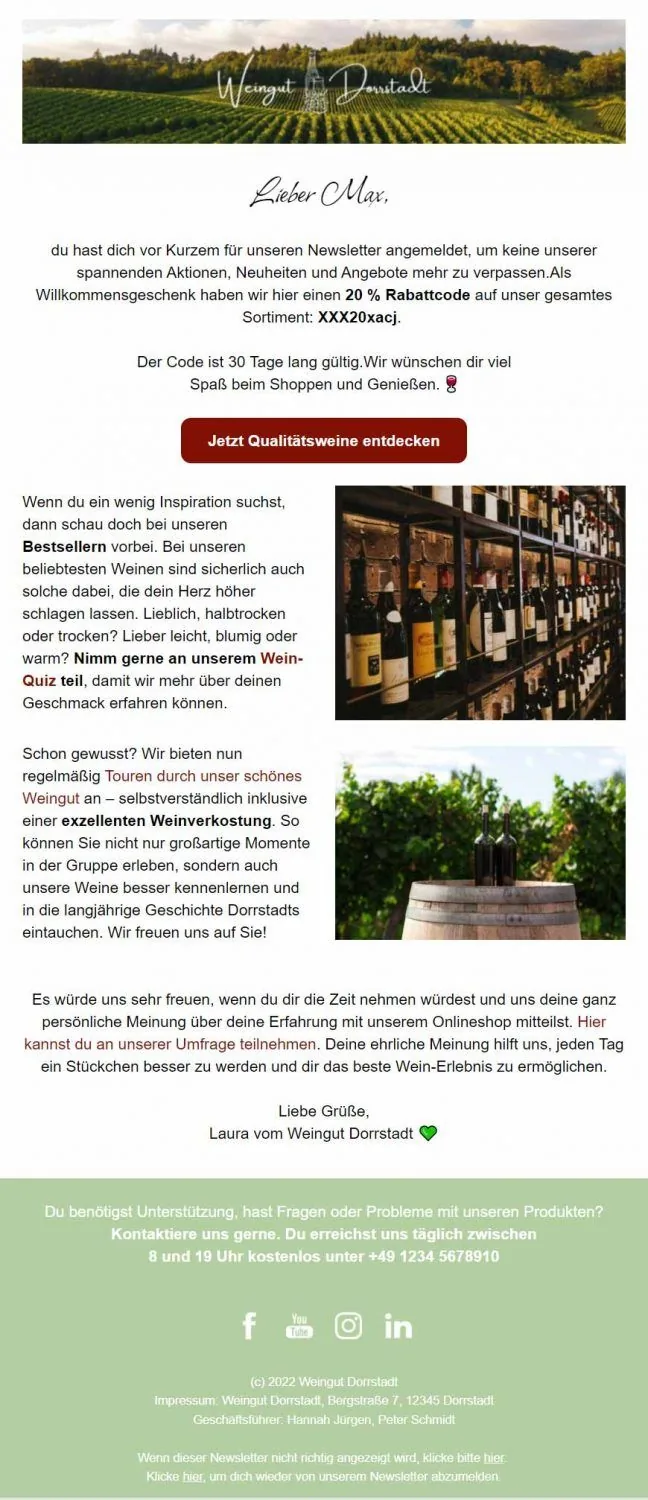
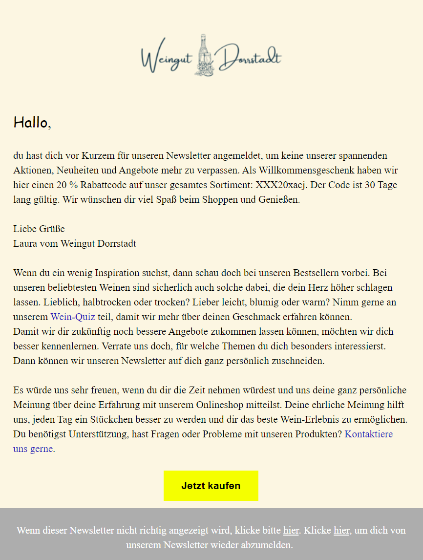
Here you can see a direct comparison between a successful newsletter design (left) and a poorly designed email (right). The newsletter on the right not only lacks a clear structure, attractive images and highlights, but also has an incomplete footer. In contrast, the design on the left impresses with its modern, harmonious color scheme, appropriate emojis and a pleasing image-to-text ratio, among other things. Which newsletter would you rather read?