9 tips for more effective newsletter call-to-action buttons than “More information”

Calls to action are often added to newsletters as buttons labeled to encourage recipients to click. However, common labels such as “More information”, “Read the article” and “Click here” say very little and are therefore often overlooked by readers. Our tips for effective call-to-action buttons can significantly increase your newsletters’ potential and click rate!
1. Make the benefit of clicking the call-to-action button clear
Call to action, or CTA for short, is a marketing term that is best described as a “prompt to take action”. In newsletters, CTAs are usually included as clickable buttons that “prompt” recipients to visit the sender’s website by clicking the button.
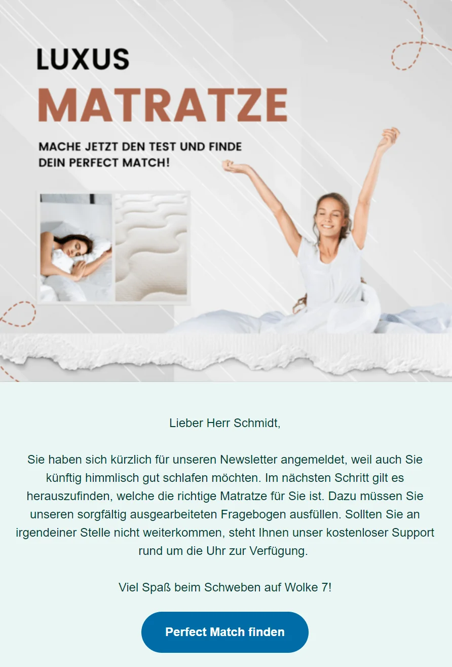
For this to work, the CTA must not only be designed to catch subscribers’ attention, but also allow them to recognize a benefit. The button label must therefore show readers that, as soon as they click the call to action, they will get exactly what they want or need most at that moment.
On the page you have linked from the button, provide your contacts with content or features that make sense for them at that stage in the customer lifecycle (prospects/new customers/existing customers/inactive customers/former customers).
Depending on your company and the product or service you offer, this could be all kinds of content: valuable tips, helpful guides, video tutorials, price calculators, direct comparisons, templates, vouchers, offers, inspiration and more. Adapt the call-to-action button label accordingly.
In summary, the call to action must have a clear message. The button label must be worded so clearly that readers immediately know where it will take them.
Newsletter call-to-action examples with a clear message
- Discover the new collection
- Try for free now
- Try free for 30 days
- Personalize for free now
- Find your jeans
- Create your own wish list
- Download the DIY guide
- Sign up for the seminar here
- Redeem your voucher and save
- Try for free
For new customers who are not yet familiar with your product, the CTA button could be labeled as follows
- Read the guide and get started
- Get tips and get going
- Follow the guide and start now
- Watch the product demo
👀 How can I find a solution that works for all my recipients?
Ideally, do not try! By segmenting your recipients or assigning tags, for example by customer group (prospects, new customers, existing customers, former customers, etc.) or interests (Which products do they buy? Which topics interest them? etc.), you can send newsletters tailored to specific target groups. This has the advantage that you can tailor the call to action and linked content much more precisely to the needs of each recipient group.
2. Newsletter calls to action using action verbs
Ideally, include an action verb in the call-to-action button label, meaning a verb that expresses an active action by your recipients: buy, order, claim, compare, save, start, download, and so on. There are endless possibilities! Verbs give your recipients the sense that they should take action immediately and provide stronger motivation to click the button.
However, make sure you strike the right tone in your customer communication. The call to action remains a recommendation and should definitely not sound like an order. For example, you can make “Redeem your voucher!” sound more elegant by writing “Redeem voucher now!”, or rephrase “Buy your favorite product!” as “Buy your favorite product”.
Combined with the active verb, a time limit or quantity restriction can emphasize the action’s urgency. “Sign up now”, “20% off today only” or “Claim one of 50 tickets” add emphasis to your CTA and increase the likelihood that your readers will click.
More examples of active CTAs to inspire you
- Download a free template/sample now
- Read the article and get started
- Get inspired now
- Order your favorite product with free delivery today
- Register for free now
- Quickly claim your welcome discount
- Redeem your voucher and save
- Compare prices now
- Get inspired
- Redeem limited code
- Come this way and be amazed
- Invite friends
- Discover the collection now
- Start your free month
3. Creative and effective CTA buttons for newsletters
You now know what a call-to-action button is and what it should ideally achieve. But what makes an effective CTA that not only draws subscribers’ attention to the website, but also generates valuable leads?
Feel free to be creative when labeling your CTAs! Make your newsletter recipients smile with a humorous label. This makes your company more likeable and motivates subscribers to click the button to see what is behind it.
Examples of creative newsletter call-to-action buttons
- All I want for Christmas (for Christmas)
- Paint it black / Back to Black / Hit the bullseye (Black Friday)
- Spooktacular offers (Halloween)
- Helau from the other side / A laaf ❤️ discounts (Carnival)
- Not the same procedure as every year (New Year’s Eve/New Year)
- Do not press! / Please do not press! (Of course, that is exactly when people click… 🙂 )
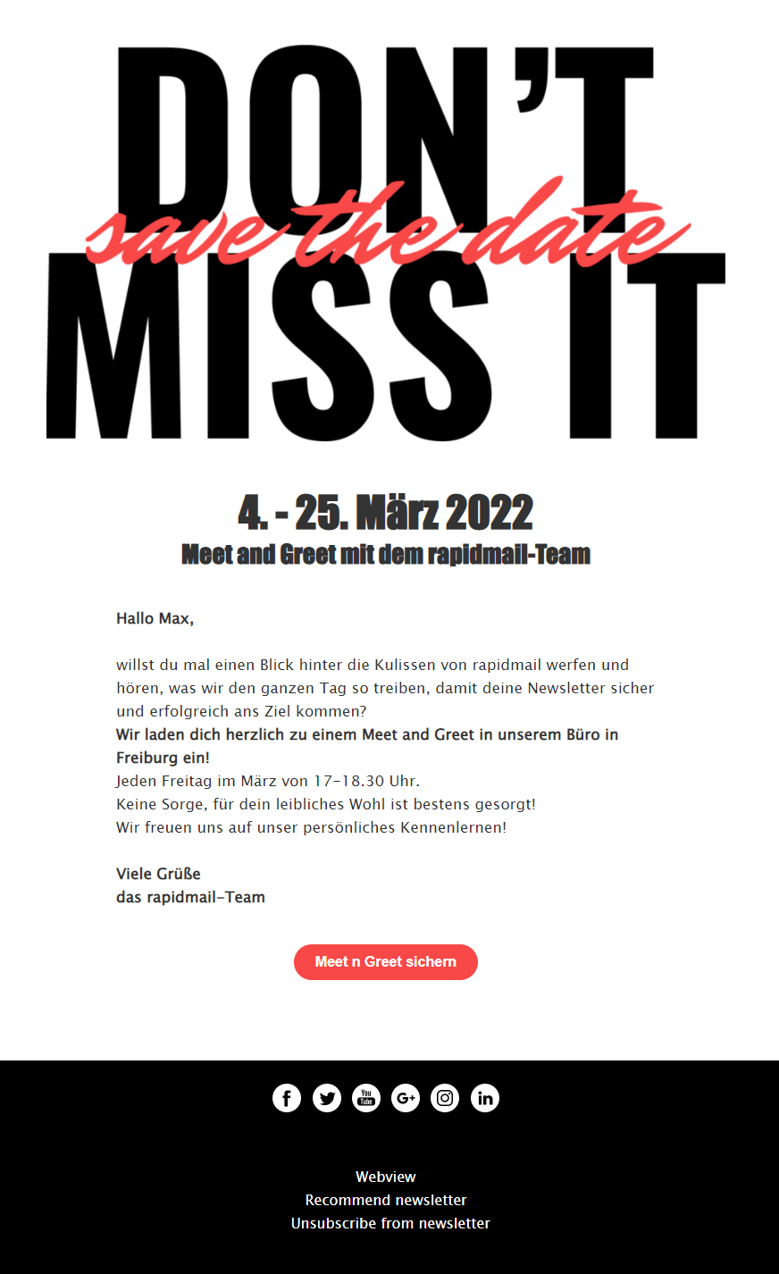
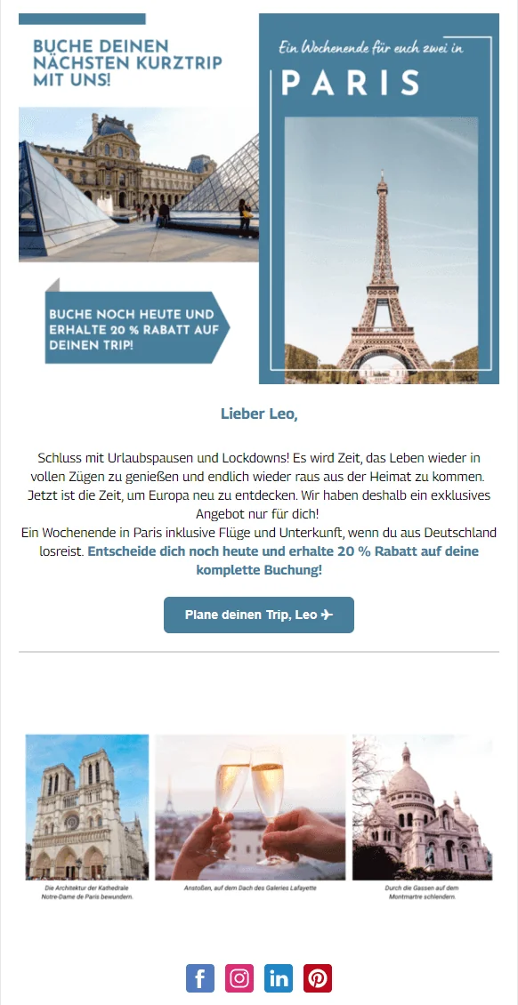
- Plan your trip, {Male first name} ✈ (CTA personalization)
- Be romantic now / Fall in love now (Valentine’s Day)
Personalized call-to-action buttons
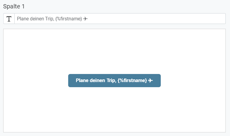
A newsletter tool such as rapidmail lets you personalize the call to action. You simply need to insert a personalization formula in the email editor. The newsletter button then automatically adapts to the subscriber’s stored name when the newsletter is sent.
4. Show your colors: Why eye-catching button colors matter in newsletters
Because the call-to-action button often forms the link to the website and is the most important element in the newsletter, its color should stand out from the rest of the newsletter. It will then immediately catch your recipients’ attention and be noticed even if your readers do not have time to read the entire newsletter.
As a general rule: the greater the contrast, the better! This is only true, of course, provided the colors work reasonably well together and do not make your subscribers recoil. For example, you should think carefully before using a lot of pink and red in the same newsletter.
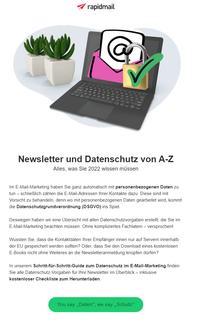
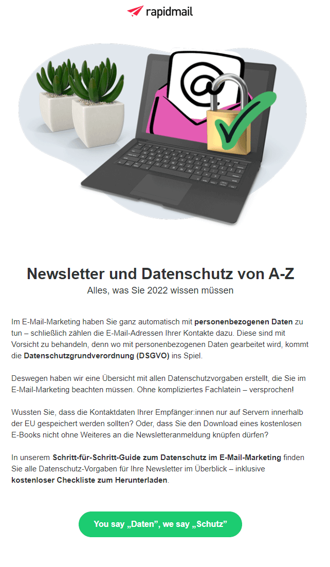
Example of different contrast levels for a newsletter call to action: the white label on the right-hand CTA stands out clearly against the green button. The CTA button on the left is a negative example: dark green text on the light green button would be far too difficult to read and would generate fewer clicks.
You should pay attention to an appealing look, including the CTA’s color scheme and shape. Ideally, it can help turn prospects into customers when they click the call to action.
5. Positioning the CTA correctly in your newsletter
We already know that a clear benefit and the visual design of the newsletter call-to-action button are highly relevant. Strategic positioning is just as important. No matter how well the button’s design suits the newsletter, even the most beautiful design is useless if the button appears at the end of a very long newsletter and may not be seen.
Position the call to action in your newsletter so that recipients do not have to scroll to find the button. The CTA should be included in the visible area of the email when it opens (“above the fold”). The same principle applies here: your subscribers may not have time to read the whole newsletter.
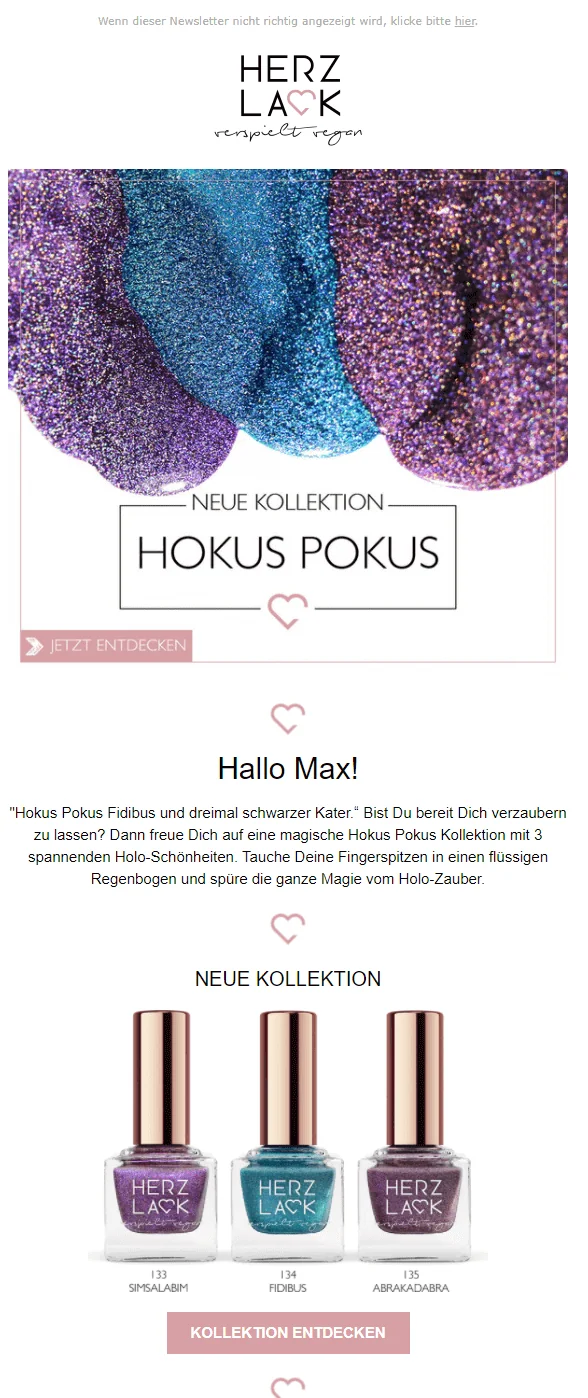
The rapidmail newsletter
Tips, ideas and news about email marketing, straight to your inbox.
If a well-positioned call to action succeeds in capturing readers’ interest, you can direct them straight to the website. Even if they can only glance briefly at the important linked content there, they will remember it later and return to your website when they have more time.
💡 rapidtip
Before sending your newsletter, use the display test and a test email to check that the CTA is in the immediately visible area at the top of the email.
6. Keep it short and sweet, including your newsletter CTA
In short: your CTA should be as brief as possible while still conveying a clear message. This is the only way to ensure that the reader takes in the entire button and its label.
A short, simple but concise statement on the button is most effective for your company and can even significantly improve the conversion rate.
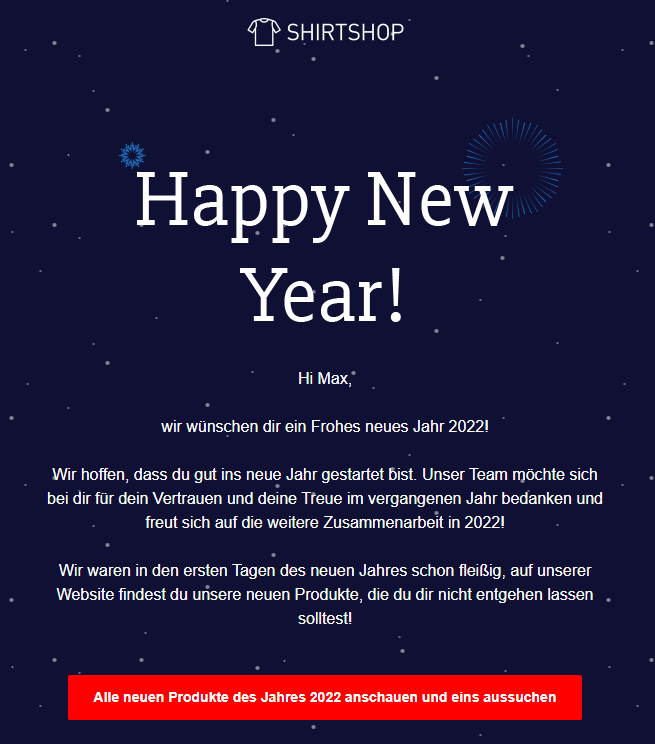
Studies have shown that the most successful CTAs contain fewer than 150 characters. A higher character count would also make the button look very long, creating the risk that the clickable call to action would no longer be recognized as such. In the following example, the CTA might even be mistaken for a simple text element in a different color.
7. The call to action as your newsletter’s happy ending
Tell your recipients a short story in the newsletter that is coherent from beginning (the subject line) to end (the CTA and its linked content) and that readers will be happy to give their attention to. Focus on the most important facts and skillfully package them as a short story.
Also try to make the newsletter copy as personal as possible. Alongside addressing your subscribers personally, you can, depending on the occasion, add a few sentences about your company’s history or fun facts from everyday office life. The CTA is the happy ending to your story that your recipients can look forward to!
8. Analyze the CTA’s label and positioning
After every newsletter is sent, it is important to check how many recipients clicked your call to action. In rapidmail, you can find the analysis for each campaign sent under Statistics > Click map.
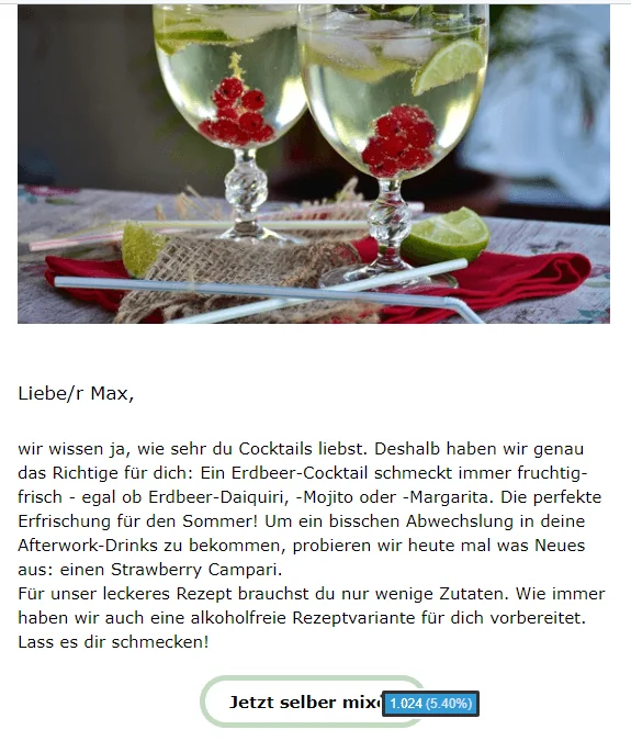
At first, try different wordings and positions and compare clicks over a longer period. This will help you discover how recipients behave when reading your newsletter and continuously optimize how you include the call to action.
Even after that, you should occasionally update the CTA label and surprise recipients with unusual wording. This prevents readers from becoming accustomed to an unchanging call to action and eventually no longer noticing it.
9. Buttons as layout elements: What you need to know
Some email programs, such as Outlook, do not display images automatically when an email is opened:
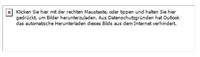
Some newsletter recipients therefore have to download the images with two clicks before they appear in the email. That is why we recommend always adding call-to-action buttons to rapidmail newsletters using the designated layout elements, rather than inserting them as images:
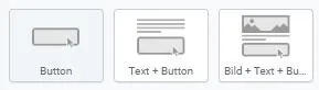
This has the advantage that the CTA is displayed directly in the campaign by every email program. It is therefore visible even if a subscriber does not right-click to download the newsletter images. Despite the missing images, there is still a chance that your contacts will click the call to action. Try it now!
Create a newsletter with effective CTAs now