The ideal image-to-text ratio for your newsletters

One glance is all it takes for your contacts to decide whether your campaign makes a good or bad impression. This decision can still be influenced if they take a closer look at the email’s content, but after a poor first impression, it often never gets that far. To win over your contacts with your newsletter in just a few seconds, an appealing layout with the ideal image-to-text ratio is essential.
1. Why is it worth using images in newsletters?
If the campaign’s layout is not easy on the eye, very few contacts will make the effort to read it. You have probably experienced this yourself: large, uninterrupted blocks of text require a great deal of concentration to read and tend to suggest that the author has not managed to convey the content in an engaging and concise way.
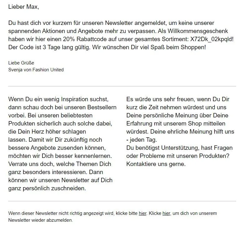
The key is to break up longer passages. Paragraphs, subheadings and images not only optimize the layout, but also create short pauses that give readers time to process and understand what they have read. An engaging header image and appealing images in the main body that support the copy can help you take advantage of the following benefits:
- Spark and maintain interest: In crowded inboxes, numerous campaigns compete for your contacts’ attention every day. Appealing images that make readers curious about your newsletter content are sure to catch their eye.
- Increase your contacts’ motivation to read the campaign’s copy carefully and engage more deeply with its content. This also allows you to provide more comprehensive and effective information.
- Images help readers remember information more effectively. Make a lasting impression on your contacts with appealing layouts and high-quality images.
- Visualize and reinforce the campaign’s message. When you need to convince readers in just a few seconds, it helps if expressive images and graphics make the campaign’s message clear at a glance.
- Increase your newsletter click rate: By using eye-catching elements strategically, you can capture your customers’ attention and guide them toward specific actions. For example, readers are then much more likely to click the links or call-to-action buttons in the email.
- In the best-case scenario, an ideal image-to-text ratio can help boost sales of your products.
In short, using images cleverly brings you closer to the goal you want to achieve through email marketing.
👀 Did you know?
With rapidmail, you can easily edit the images for your newsletter without any prior knowledge or additional image-editing tools. Our new image editor lets you crop, rotate or flip images directly in your campaign and choose from a range of great filters. The rapidmail image editor also makes it easy to resize images in multiple columns to the same dimensions or place text on images in your finished design.
2. Why is the ideal image-to-text ratio so important?
A picture is worth a thousand words? Yes, but only if it is displayed. Some email clients require images to be loaded manually first. When contacts initially open the email, they will then see only the written copy and placeholders for the images. This is why it makes sense to use images only to support the text.
💡 rapidtip
Adding alt text (alternative text) to your images prepares you for situations where they are not displayed. Contacts cannot see the alt text as long as the image loads correctly. However, if the email clients block the images, the alt text describes what they show. This makes the newsletter appear trustworthy to email clients and provides contacts with the information it contains even without the images. Alternative text also offers a major accessibility benefit: screen readers can detect it and make the information conveyed by images accessible to people with visual impairments.
We often see buttons, headings or even entire passages first created as graphics and later inserted into the newsletter as finished images. This approach undoubtedly offers many design possibilities that newsletter editors cannot support for technical reasons. However, if the entire newsletter is made up of images, which is something we have also seen, contacts will see absolutely nothing when they first open it.
You can also read our post explaining exactly how to embed images in newsletters.
The rapidmail newsletter
Tips, ideas and news about email marketing, straight to your inbox.
👀 Have you seen this?
Would you like to know what really matters when designing your newsletter? It could not be easier: in this video, our Content Manager Wiebke shows you how to impress your contacts with beautifully designed newsletters. Let’s roll! 🎬
Open video transcript
Chapter 1: Introduction
First impressions count in email marketing too! If your newsletter design looks confusing or boring, your email probably will not be read. Fortunately, with the right tips and tools, designing beautiful newsletters is no longer that difficult, and today I’ll show you how!
By the way, this is lesson 3 of my newsletter course, which will turn you into a real expert even if you are a beginner. If you would like to learn more of the fundamentals of successful email marketing, make sure you watch the other lessons too. For now, though, let’s focus on newsletter design. Let’s get started:
Chapter 2: Why good newsletter design is so important
When contacts open your newsletter, its design determines whether they keep reading or close the email straight away. Ideally, the design should attract attention, make the content quick to grasp, guide your readers effortlessly through the email and, of course, reflect your brand.
To achieve that, you first need a basic structure:
Chapter 3: The right newsletter structure
A good newsletter structure typically consists of a header area with a logo, image and heading. Your contacts should be able to tell immediately from the image what the newsletter is about. It is also best to link the image, as many people usually click this area.
Next, include a short, friendly greeting, then continue with the various content blocks and images in the main section. Place your call-to-action button as high up in the campaign as possible so that readers do not have to scroll to reach it. This automatically increases the likelihood that more people will click the button.
Finally, the footer at the very bottom includes an unsubscribe link and legal notice. Adding your name and a photo to your signature immediately creates a personal impression for your contacts and can help you build a long-term relationship.
It is also important for the newsletter to have enough white space: empty areas that prevent it from looking cramped and give your readers’ eyes a short break. Paragraphs, dividing lines, different columns and a good mix of copy and images also keep your newsletter clear and help you guide contacts through the different content in a targeted way.
If you still find this a little difficult, I recommend starting with a newsletter design template. Most newsletter tools let you choose from various options and then fill the template with your content. This gives you an excellent basic framework and allows you to complete your newsletter design much more quickly.
Chapter 4: Designing a newsletter in your corporate design
But if everyone only ever used templates, all newsletters would end up looking the same, wouldn’t they? That is why I recommend adapting your newsletter to your brand’s corporate design. This immediately makes it more recognizable too.
Fortunately, 1-click design makes this really easy. All you need to do is enter your URL, and your corporate colors, logo, fonts and social links are automatically transferred from your website into the design. Of course, you can still make changes, such as replacing the colors, modifying the button or adding more social links. Once you save your design, it is automatically applied to many of the templates, giving you plenty of truly customized options for your newsletter design.
Chapter 5: Considering accessibility in newsletter design
When thinking about your newsletter’s design, you should also keep in mind people who, for example, have a visual impairment, limited experience with digital media or cognitive impairments. Your newsletter should be accessible to everyone!
To make this possible, ensure there is sufficient contrast between your text and the background, for example, dark gray text on a white background instead of light gray on light blue. To make your newsletter even easier to read, you should also choose a font size of at least 14 pt.
As a general rule, your newsletter should look good on all devices, including smartphones and tablets. With rapidmail, every newsletter automatically adapts to the screen size of the recipient’s device, so you do not need to take any extra steps for responsive design. When creating your design, however, remember that multiple columns displayed side by side on a desktop will appear one below the other on a smartphone.
Chapter 6: Conclusion
As you have seen, a few basic rules and aids such as ready-made newsletter templates or 1-click design make designing beautiful newsletters really straightforward.
In the next lesson of “Learn email marketing”, you will discover how to tailor your newsletter perfectly to your target group using personalization and segmentation. Be sure to watch the episode if you are interested in the topic!
3. So what is the ideal image-to-text ratio for newsletters?
Less is more! Despite all the benefits, images should therefore be used sparingly and selectively. As a rule of thumb: 2/3 text, 1/3 images. This also has positive effects on your newsletter, as it minimizes both the risk of being classified as spam and the email’s loading time on mobile networks.
When you create your newsletter online, you should also avoid using images that are too large. As a guide, you are always on the safe side with an image width of less than 600 px and a file size of around 100 kB. To prevent an overloaded newsletter from landing directly in the spam folder, rapidmail checks your email’s file size in our free spam test before every send.
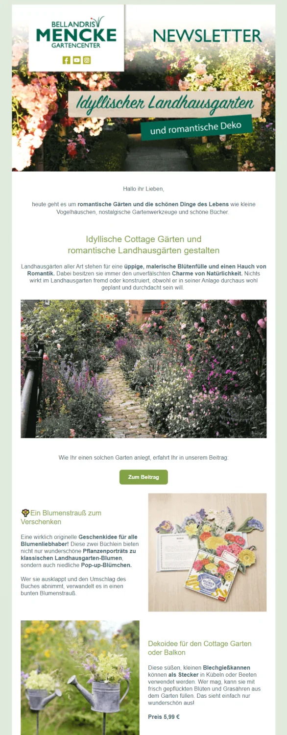
👀 How should I arrange images in my newsletter?
Whether you arrange images that support your copy one below the other or side by side in columns is largely a matter of taste. Naturally, however, the campaign’s readability and aesthetics should come first. You should also ask yourself whether an image makes sense in its particular position, for example by visualizing your message or showcasing a product. Always bear in mind, though, that your newsletter will be displayed differently on desktops, tablets and smartphones, and that multiple columns will appear one below the other, especially on smaller screens.
4. What happens if I do not follow the recommended image-to-text ratio?
Be careful: emails with too many images and too little text can look cluttered and confusing. They can also lead to long loading times and high data usage. Because many spam filters check the ratio of images to text, a newsletter that is too image-heavy could end up in your contacts’ spam folders or not be delivered at all.
To ensure your newsletter’s deliverability, you should always maintain the ideal image-to-text ratio of around 30:70 and focus on a small number of functional, high-quality images. Before each of your newsletters is sent, rapidmail checks whether you have maintained the ideal image-to-text ratio.