Dark mode for emails: Do newsletters need a different design?

When was the last day you did not look at either a computer monitor or a smartphone screen? You probably cannot even remember. To give your eyes a break, you may already have switched to dark mode, like many users: it is easier on the eyes and instantly makes many apps and websites look more modern. Email programs such as Outlook and Gmail can now also be switched to dark mode. Not bad! But wait: do newsletters need a different design in email marketing so that they look stunning in dark mode too?
1. What is dark mode?
The iOS and Android operating systems introduced dark mode, also known as black mode or night mode, back in 2020. In dark mode, the colors displayed in programs or apps are reversed. The aim is to reduce the often very high proportion of white: light elements become dark, and dark elements become light. Dark text on a light background becomes light text on a dark background in dark mode. Icons and other dark-colored graphic elements may also be given a lighter appearance in dark mode, depending on the program. But why?
Compared with a conventional design featuring light background colors, dark mode is intended to offer users important benefits because it:
- 👀 is easier on the eyes, which is essential for people with high sensitivity to light
- 🔋 conserves battery power
- ⚡and therefore saves energy
More and more tools and apps offer users the option of dark mode for the user interface in addition to the standard view (“light mode”). Many email clients are also following the trend and providing users with a darker program design.
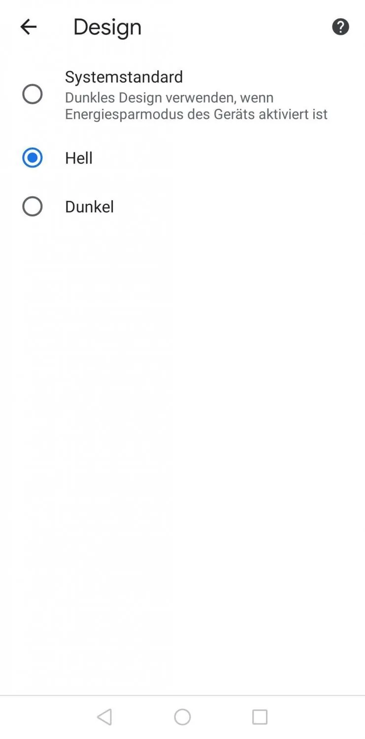
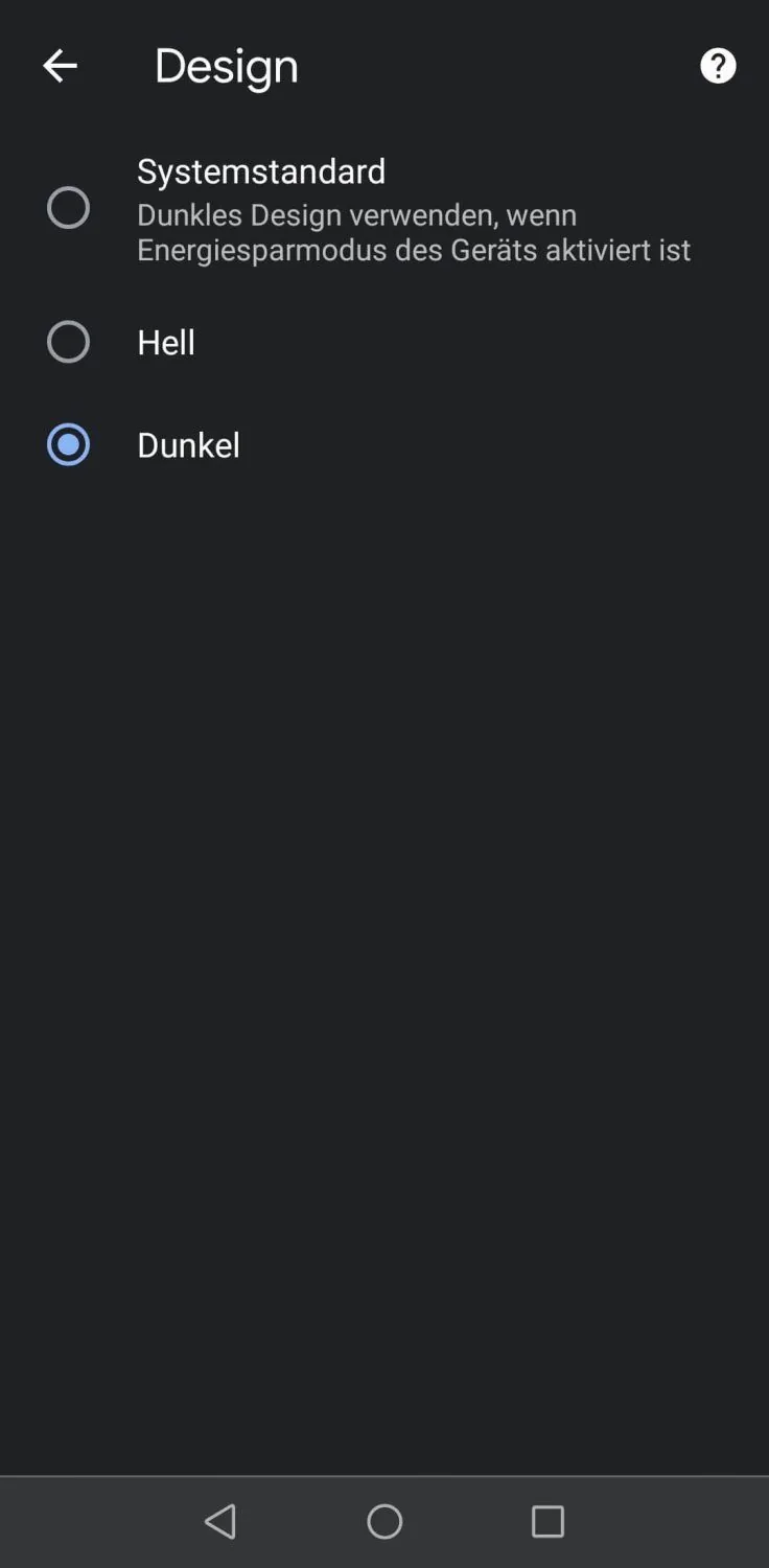
Example of the design settings for Google Chrome on a smartphone (Android): users can choose whether the browser is displayed in standard or dark mode.
2. Which email clients offer dark mode?
Users cannot yet switch from the standard view to dark mode in every email program. AOL, for example, does not currently offer dark mode.
However, other major providers now offer dark mode, including, as of June 2021:
- Outlook (Windows, iOS, macOS Webmail)
- Gmail (Android, Webmail)
- Apple Mail (iOS, macOS)
- Web.de (Android, iOS)
- Yahoo (Android, iOS, Webmail)
- GMX (iOS)
- Spark (Android, iOS)
- Windows 10 Mail
Depending on the email client and operating system, users can choose whether only the app’s user interface should appear in dark mode or whether the colors in the emails themselves should also be reversed. With the second option, the HTML code of the incoming email is changed automatically. The result is that the color scheme within an email also matches dark mode, with high contrast and usually a dark background and light text.
At this point, newsletter senders will be paying close attention: does color inversion in dark mode emails also affect how newsletters should be designed? In fact, dark mode for emails is not always beneficial for senders or readers. If, for example, color inversion causes an advertising newsletter to be displayed to recipients in a completely different way than intended, the email may no longer reflect the corporate identity colors. Dark mode can also be disruptive for readers if it makes parts of the email difficult to read.
3. How are newsletters and emails displayed in dark mode?
To find out how to make newsletters “dark mode friendly”, we will first look at the different types of dark mode.
Type 1: Dark mode without changes to the email’s colors
Some providers let users set dark mode to change only the color of the user interface, from light to dark, without applying dark mode to the emails themselves. Dark mode then has no effect on the displayed color scheme of emails or newsletters. For you as a newsletter sender, this is the simplest dark mode behavior: all subscribers see your newsletter exactly as you designed it.
Example (Outlook for Windows):
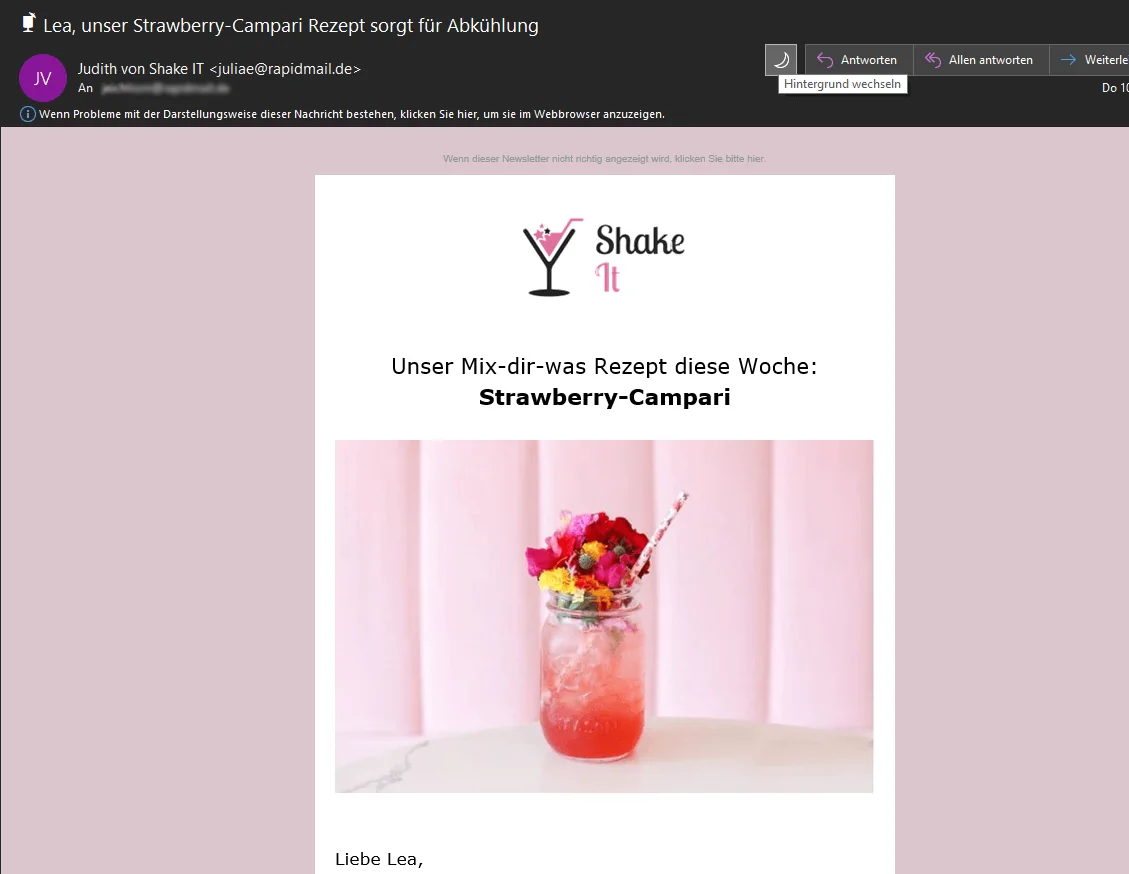
Dark mode for the Outlook user interface can be activated in the Outlook settings. By clicking the sun or moon icon in the email header, users can choose to display each email in light mode nevertheless. In other words, the email client is used in dark mode, but color inversion can be turned off for the email itself.
Type 2: Dark mode with partial changes to the email’s colors
With partial inversion, the colors of all areas and elements where dark text or graphic elements appear on a light background are reversed. For example, black text on a white newsletter background becomes white text on a black newsletter background.
Example (Spark on iOS):
The black newsletter text on a white email background (left) is inverted to white text on a black newsletter background (right). Because there are no light elements on the black newsletter background, the background color is not inverted and remains black in dark mode.
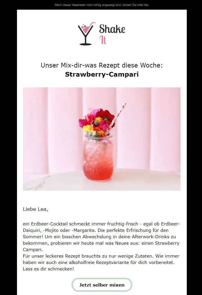
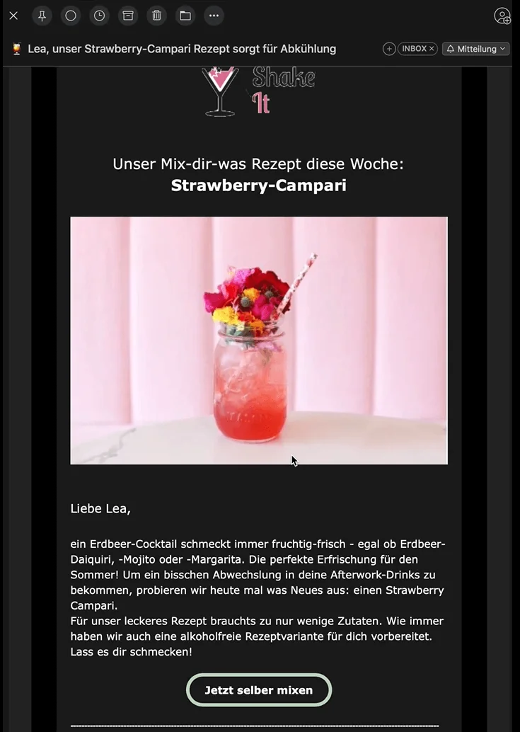
The same newsletter in two different views: the left shows the newsletter as it was designed, while the right shows it in dark mode (Spark on iOS). Partial color inversion is visible.
Type 3: Dark mode with complete changes to the email’s colors
With full color inversion in dark mode, all colors are reversed: everything light becomes dark, and everything dark becomes light. Certain colors are also adjusted or changed, presumably to achieve optimum contrast within the email. This is the least popular type of dark mode among newsletter senders because all the colors used in the campaign may ultimately look different to subscribers.
Example (Outlook for Windows):
Both light and dark areas are inverted. Here, the newsletter color changes from white to black, while the background color changes from black to light gray.
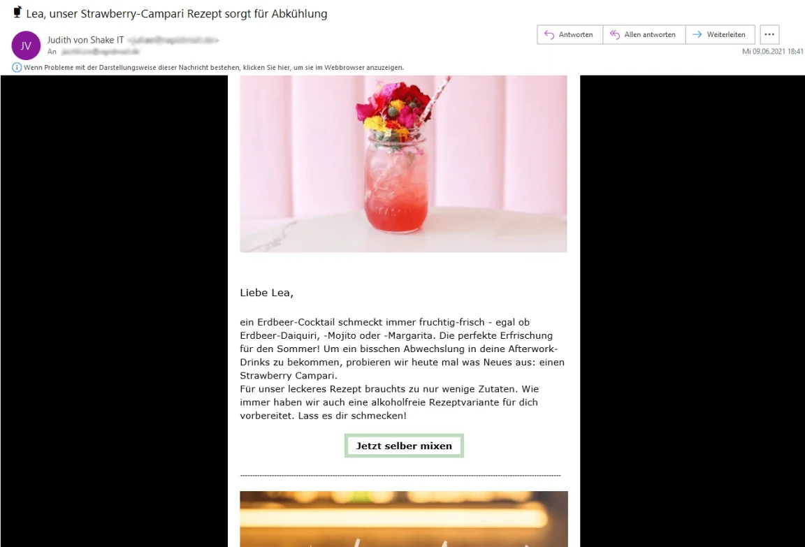
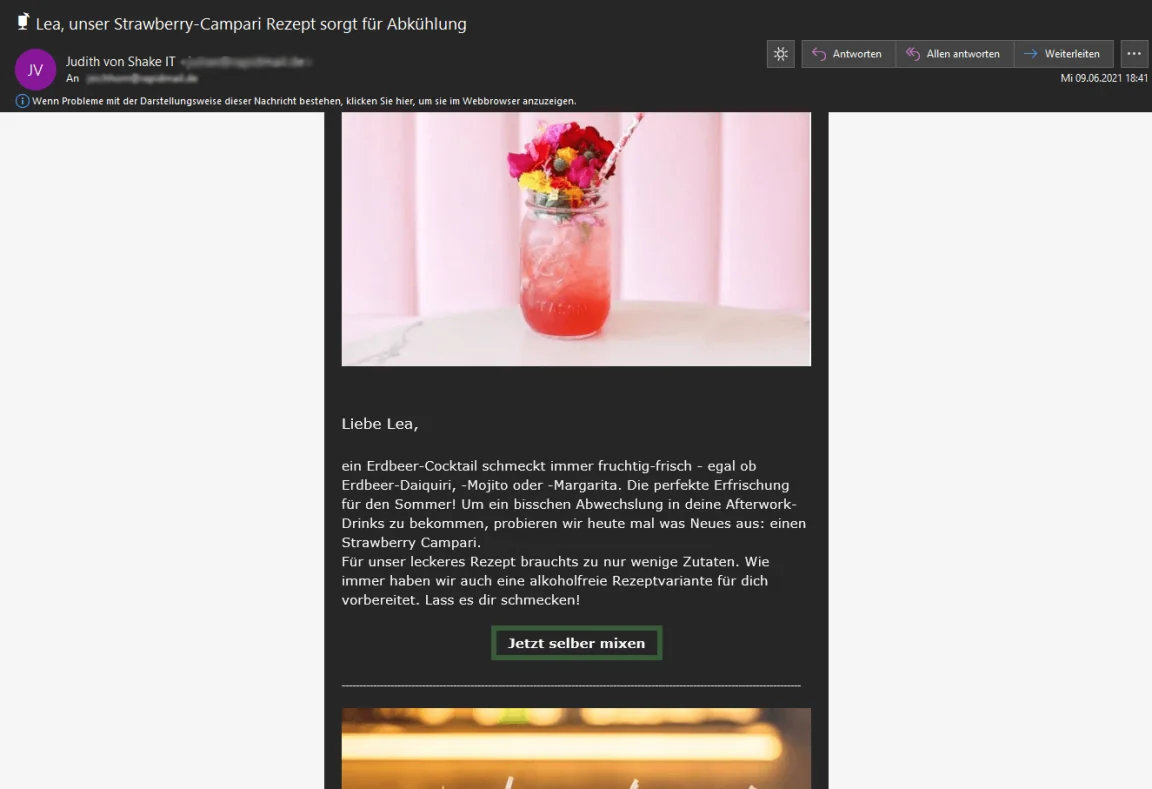
In Outlook for Windows too, the newsletter looks different in normal mode (left) and dark mode (right). For example, the black campaign background turns gray, while the campaign color changes from white to black. Full color inversion is visible.
4. How should I optimize my newsletters for dark mode?
Do not worry, you do not need to design a separate newsletter for dark mode. As a sender, you have no way of determining exactly which recipients use the standard view or dark mode to read newsletters.
Nevertheless, you can take a few simple steps to optimize your newsletters so they look good to all readers, whether they use dark mode or not:
Step 1: What does your newsletter look like in dark mode?
Before you panic and pick up the phone to make an emergency dark mode call to your design team, it is worth opening your newsletter in dark mode yourself first. It may look even better that way!
Sign up with various email providers. Then use rapidmail to send a free test email of your newsletter to these test email addresses.
View the newsletter in the different programs and on every device: what does it look like?
- 👁️ Can you read all the text without any problems?
- 📢 Does the call to action stand out enough from the background?
- 🖼️ Are all graphics, logos and icons clearly visible?
- 🔲 Do rounded graphic elements suddenly appear inside an unattractive white box?
- 🎨 Which colors and elements are transformed in a way that adversely affects your corporate identity, for example?
Senders whose newsletters have a relatively simple design may be surprised to find that the email also looks good in dark mode, without anything having been specifically optimized for it. If so, no further steps are required.
So test your newsletter first and check how “bad” your campaign actually looks in dark mode.
Step 2: How many readers use dark mode?
Around 15% of users currently use dark mode. Among iOS users, the figure is around 36%. Take a look at the newsletter statistics for campaigns you have already sent to make a rough estimate of how many of your recipients read your emails in dark mode based on their client usage.
Would you like to know how many readers actually use it? Ask them. An email survey can help you find out how popular dark mode is with your target audience. As an incentive, you could give away a voucher to one of the survey participants, for example.
Have you discovered that your newsletter does not exactly look attractive in dark mode, but that a large number of subscribers use it? Then it is time to give the newsletter a slight redesign.
The rapidmail newsletter
Tips, ideas and news about email marketing, straight to your inbox.
Step 3: Optimize your newsletter for dark mode
- Use image files in PNG or GIF format rather than JPG: transparent images without a background prevent your images and graphics from acquiring an unattractive white border in dark mode.
- Use simple background colors: to separate different sections of the newsletter visually, choose simple background colors such as white, light gray or dark gray. These generally lead to fewer unpleasant design surprises in dark mode.
- Give dark graphic elements a white outline: adding a light outline to your logo, for example, ensures that it remains visible in dark mode.
💡 rapidtip: Test, test and test again
The newsletter test send with rapidmail lets you thoroughly test how your campaign is displayed across all email clients and devices before the main send. This is the best way to find out how to use colors, outlines and graphic elements so that your newsletters look stunning to every recipient, including in dark mode.