Improve your newsletter design with web fonts
 Lea·

Design is clearly an essential part of a compelling newsletter that delights your readers. But what makes a successful design? Alongside the layout and text-to-image ratio, the fonts you use in your emails also play a major role. Whether elegant, professional or creative, different fonts are an excellent way to reflect the character of your newsletter or brand. With our 40 new web fonts waiting for you in the rapidmail email editor, you can now give your emails a truly personal touch!
1. Definition: What exactly are web fonts?
Web fonts (web = internet, font = typeface) are digital typefaces used online, for example on websites or in emails.
In the context of email marketing, web fonts are not the standard, run-of-the-mill fonts. Instead, they are fonts that are not installed on newsletter recipients’ devices by default. However, they can still be loaded and displayed in emails, much like images. In other words: web fonts are digital typefaces that are generally displayed even when they are not installed on recipients’ devices.
How they differ from standard fonts
Only a few fonts can be used without restrictions in emails and on websites. These are known as “email-safe fonts” or “web-safe fonts”. They come pre-installed on most devices and can be displayed without restrictions in all common email clients, for example. Standard fonts such as Times New Roman or Arial are therefore always the safest choice. In this case, your newsletter’s font will appear as intended for all recipients.
However, a company’s or self-employed professional’s design concept includes not only elements such as the company logo and the color scheme used for its website and newsletter, but also specific fonts used across all communications. Ideally, these fonts reflect the company’s character and create brand recognition among readers and prospects. Web fonts allow you to use the typeface from your other corporate communications in your email marketing too.
👀 Did you know?
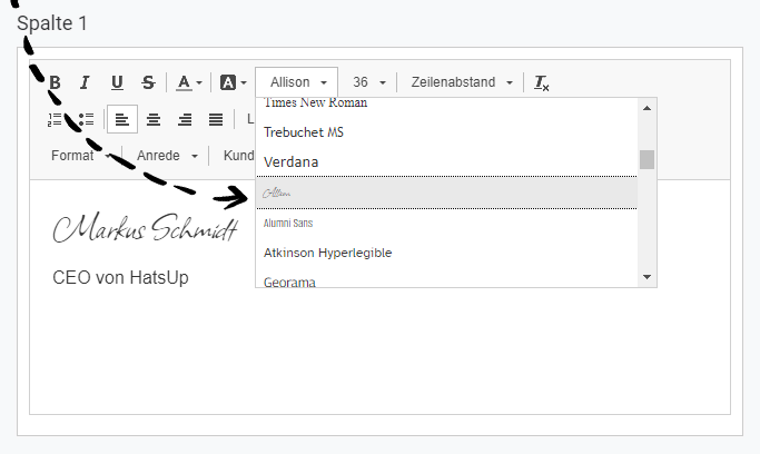
You will find around 40 different web fonts in the rapidmail email editor, giving you even more creative freedom in your emails. When you create a newsletter, you will find the web fonts directly below the standard fonts:
Web fonts and data protection
Web fonts are usually obtained from external providers such as Google. At rapidmail, however, web fonts are stored exclusively on our own servers. This means using rapidmail web fonts is completely safe from a data protection perspective, as no external servers are accessed.
If you use another tool that sources its web fonts from Google, for example, you would need to mention this as the sender in your privacy policy. Fortunately, with rapidmail you can skip this step because your privacy policy already mentions that you use rapidmail. So you can improve your newsletter’s appearance with complete peace of mind! ✨
2. Good to know: Tips and insights for displaying web fonts successfully in emails
We now know that web fonts are usually not pre-installed on your subscribers’ devices but, in our case, are retrieved from rapidmail servers.
However, it is important to understand that not every email client can display web fonts without issues. There are barely any display problems on Apple devices, for example, whereas many current versions of Outlook cannot display web fonts.
But there is no need to worry. Our experts have defined several suitable substitute fonts for each typeface available. These are known as “fallback fonts”. They are used automatically if a recipient experiences display problems and your originally selected web font cannot be shown.
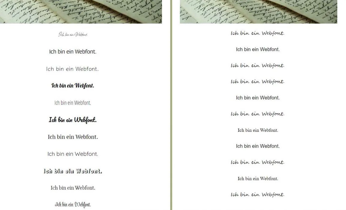
These fallback fonts are defined to be as similar as possible to the web font you selected. This means that, for readers whose email client cannot display web fonts, the newsletter will still look as close as possible to the design you originally created.
For example, it might look like this:
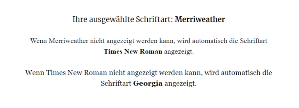
…and if none of the three fonts can be displayed, a standard serif font is used as a last resort. Either way, the newsletter you worked so hard to create will not have to go without an attractive font! So there is no need to worry that your newsletter copy will not be displayed at all when you use web fonts.
A closer look: The effect of fonts
From traditional to modern and playful to minimalist, there are fonts galore. That is why we recommend thinking about both your company or brand and your target audience when designing your newsletter.
Fonts can certainly evoke emotions in your readers. They create associations that readers will connect with your company in the future. They also create brand recognition subconsciously: newsletter subscribers who regularly see a title in a particular web font when they open your emails will associate that font with your brand in other contexts too.
The following overview will help you choose the right web font for your newsletter:
| Serif fonts | Sans serif fonts | Handwritten fonts | Script fonts | |
|---|---|---|---|---|
| Example fonts | Times New Roman; Georgia; Merriweather | Arial; Verdana; Roboto | Allison; Style Script | Lobster; Pacifico |
| Use | Particularly long passages of text | Particularly short passages of text | Headings, sender signatures, short quotes | Headings, sender signatures, short quotes |
| Effect on readers | Professional, traditional, intellectual, reminiscent of newspapers | Modern, youthful, technical, without embellishment | Personal, individual, with a handwritten character | Celebratory, elegant, with a handwritten character |
💡 rapidtip
Do not use more than two different fonts in your newsletter. Too many fonts can make the design feel complex and tiring to your readers. For example, use a distinctive font for the heading and a “simple” font for longer blocks of text. Alternatively, a single font can be enough if you vary its use with italics or different sizes.
How to use web fonts successfully in emails
- Do not choose fonts on a whim: Consider your target audience and the content you want to communicate. Fonts that resemble handwriting are better suited to highlighting headings. They have a playful character. For more serious content, plain, “clean” fonts are a better choice.
- Follow your corporate design guidelines: Choose fonts for your newsletter that complement those on your website. Just like your newsletter’s color scheme, the fonts you use should suit your company. Your readers should recognize the design and associate it with your company.
- Do not let web fonts spoil your emails: Pay attention to your newsletter’s readability. Choosing the right font plays a crucial role in ensuring the best possible reading experience. Long passages of text should use an unadorned font so that they are as easy to read as possible. Small, playful accents, on the other hand, allow you to influence the newsletter’s emotional effect. This makes your newsletter more expressive and can quickly turn it into an eye-catching design.
- Keep your newsletter design consistent: Find the fonts that best suit you and your company, and stick with them. Readers may find it confusing if they see a new newsletter design and new fonts every week.
The rapidmail newsletter
Tips, ideas and news about email marketing, straight to your inbox.
3. Examples: Using web fonts effectively in newsletters with rapidmail
That is enough theory about web fonts and the effect of typefaces. Now it is time to get practical. How can you make your newsletters shine through clever use of web fonts?
We will show you with a few examples:
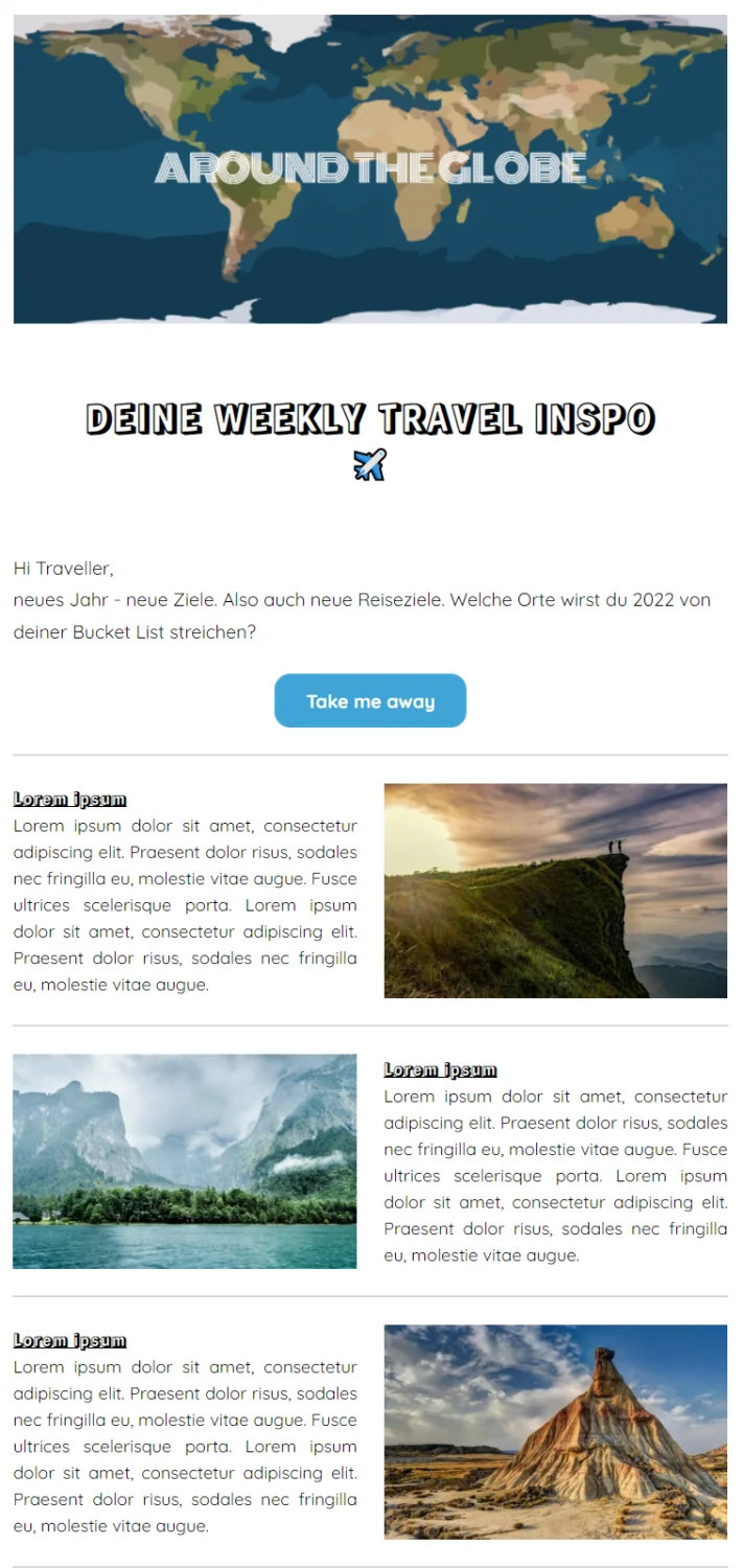
🎨 Less is more
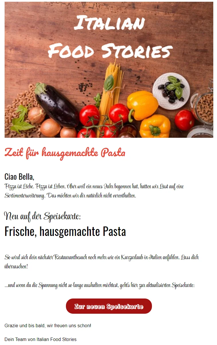
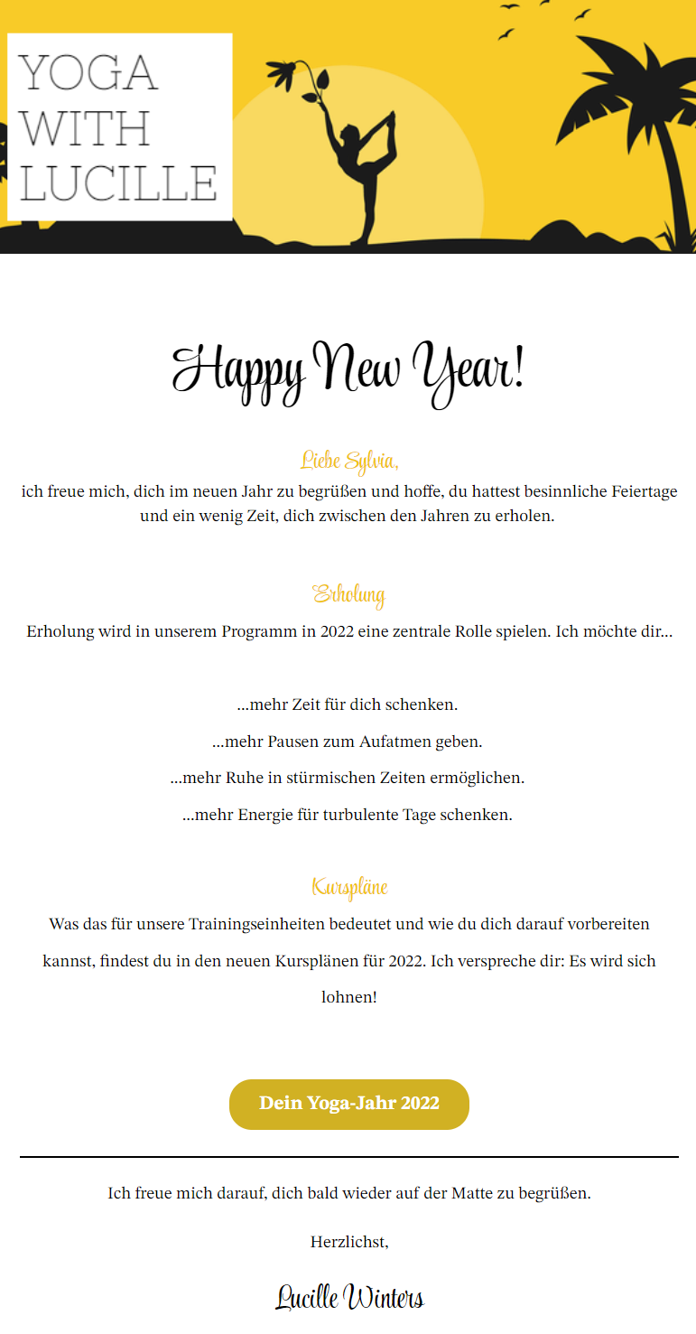
🎨 Web fonts meet your tone of voice
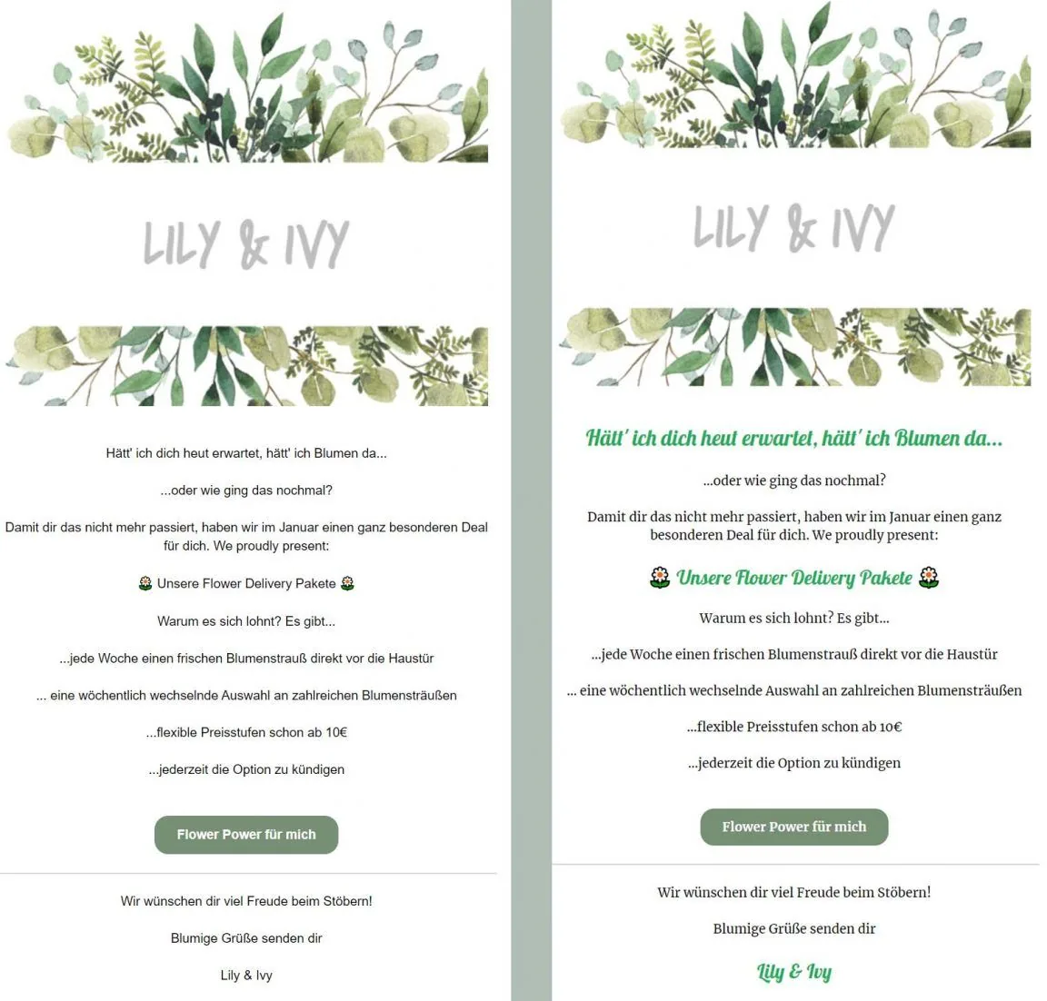
🎨 Without web fonts vs with web fonts
4. Watch out: What can go wrong with web fonts?
Using web fonts in newsletters is not only fun and gives your emails a personal touch, it is also completely safe. If fonts cannot be displayed, alternative fonts appear automatically. Your newsletter copy will therefore always be readable. Depending on the web font, your recipients probably will not even notice when their email client uses a fallback font. Given the design possibilities available to you as a newsletter sender, we definitely recommend using web fonts. Simply give them a try!
Even so, we would like to summarize a few points to keep in mind when using web fonts in emails:
- Not all email clients support web fonts. To test how your newsletter appears in different email clients before sending it, you can run a display test, for example, to check whether you are also happy with the fallback fonts if necessary.
- How web fonts are displayed depends on other resources. If there are problems with the rapidmail servers or your recipients’ internet connections, for example, the web fonts may not load. The fallback fonts will also be used in this case.
- Web fonts are generally not pre-installed but loaded afterwards. This means they increase the download volume and therefore your email’s loading time. With a working internet connection, however, this accounts for only a fraction of the loading time and is no cause for concern.
- Some versions of Outlook cannot display web fonts. The fallback fonts are used here too. If there are still problems, Outlook uses Times New Roman by default.
But why not get started? We hope you enjoy all the new design possibilities that web fonts bring to your newsletters.